
I'm actually working on this project. I'll upload content soon
While heading the 2024, I had to re-invent the whole visual architecture of Nexus ... with another technology, Figma 😅 Yes indeed, Adobe couldn't keep up the design market pace concerning app design. We all know: Adobe has too many products to watch for! In fact, other thirdy part companies specialized in app production, like Figma among the best one, were competing at the highest level. As a result, Adobe failed the software XD and most of Designers, me included, had to make a choice: migrating to Figma or virtually die
Not a problem at all, I used alotta softwares along the way. In fact, considering the period in which I've been active since 2001, I can tell I have seen a lot going on in the field of Information Technology, like drawing softwares and a variety of programming code languages. Some have evolved across the years, while others have become extinct. This requires a commitment to ongoing upskilling to maintain a competitive edge and a willingness to integrate these technologies into their creative workflow, focusing on strategic and human-centric aspects while leveraging technology for efficiency.

To plan and set up a design project, it's important to define the project's goals, scope and stakeholders by clearly defining what the project aims to achieve and making sure they are specific, measurable, achievable, relevant, and time-bound. I created a set of documents to help viewers understand the field of Design System. Following the break down task, I created a blueprint to kick start the foundations as a ground for the final publishing step
Making Design System does not only mean designing components, but also evolving an obsolete work process, or even making innovation. In fact, a proper Design System identifies problems within a work process that prevent the correct execution of the Design subject and Designers themeselves. Innovation means identifying the process used at present and within this understanding the obstacles that have prevented the successful execution of design matter. Then, depending on the case, it would involve developing a new method or modifying the existing one to improve it. By doing so, not only designers are fully committed, but all other staff including stakeholders, project managers and developers must also become active participants.
It is necessary to abandon old habits and embrace new ones to keep up with the modern times; this often generates doubts, misunderstandings, and discussions.


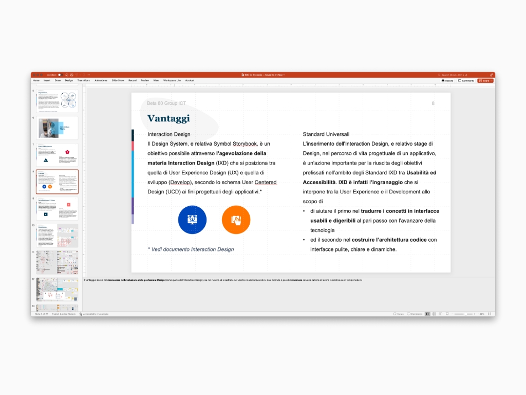


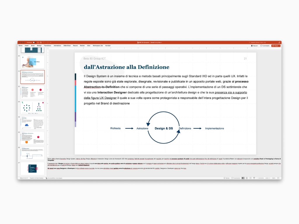
Principles: without them, everything would be open to everyone's opinion! Standard promote a guideline and apply it with scientific criteria not only to preserve the Design profession, but also and above all for the benefit the final user. As Design might seem a little difficult for most of the customers, even peers at work, I produced a set of analogies to make it even more clear


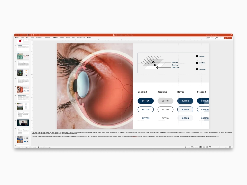
The Design System supports design through controlled review sessions (Quality Control or Contribution). The Design System is not absolute or definitive; instead it is a dynamic framework that scientifically adapts to a brand's product based on identified needs. Quality control is not an obstacle, nor a competition, but an invitation to engage in a healthy and balanced design debate for a better Design System. For these reasons, it is often referred to as a contribution process. Therefore, where the Design System does not meet the needs, it would be appropriate to investigate and integrate with new studies in the form of new cases or additions, both to meet the nature of the requested services. Similar interventions are designed to complete and/or strengthen the Design System scope in the form updates or upgrades


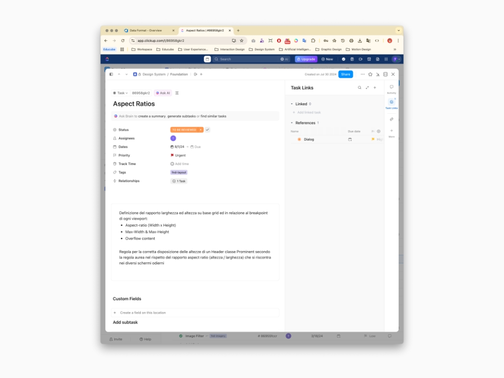

The Design System is divided into high-level modules such as Principles, Foundation & Patterns up to the more detailed one Components. To do so it's necessary go through a preliminary study and analysis, so called Blueprint. In fact, every single principle and element is being analised and designed according to usability and accessibility requirements, in order to offer a scientifically reasoned interface, based on universal standards. Essentially, Design Architecture is designed to create a foundation that can not only manage the visuals of current services (web or native apps), but also integrate future implementations, avoiding visual discontinuity and/or incompatibility of the interactive experience, and above all, starting from scratch.


As the process of content creation is happening, it's necessary to portrait concepts and ideas in the form of user interface elements to give meaning and visual appealing. Yes indeed, a dedicated library is designed to provide viewers with visual understanding about complex interactions and visual expression. Next as a final design step, the entire set of text and images is imported within a documentation. In other words, this content is the main ground to build an advanced Ui Library on, in the sense that it tells a story of elements that change as the Nexus evolves according to technological advances


A design system project is the process of creating a shared set of standards, reusable components, and guidelines to build consistent, scalable digital products. To do so, I produced a Symbol Library which in turns transformed into an Angular Library, also known as Storybook. Also, I designed a product web app, Nexa, that is developed and marketed to a broad, general audience for purchase or use, rather than being a custom solution for a single client.
As technology evolves, designers must continuously learn new tools and adapt to changing techniques and trends. Nowdays before diving into design, it's essentially to setup variables and token later on useful to generate and maintain modular user interfaces in terms of dark & light themes, density and multi brand. I planned the classic approach: writing a set of primitives which in turns are transformed into tokens. Next, each token is mapped within every single elements across the modules of Foundation and Component. Also Token can be duplicated with Modes functionality to meet the multi brand requirements as well. Yes, it's hard work. But,once it's done, you come up with a dynamic Ui Library that I like to call Symbol Library


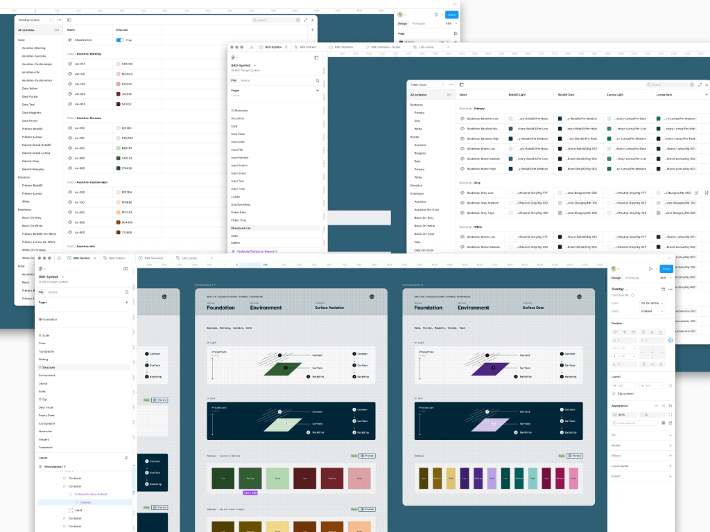


In this section is included a guide to all the visual elements to create a consistent user interactive experience, according to Nexus principles and identity guidelines. Foundation falls under these categories: Structure, Scale and Computer Imagery Generated. Each category has several sections such as: Color, Typography, Writing, Accessibility, Environment, Layout, Interaction, Data Visualization, Iconography, Illustration, Imagery, Motion, Texture, Trademark
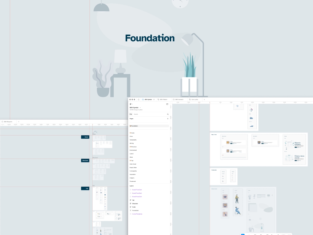


Here you can find a collection of reusable building blocks. Each component has a specific role, specifically created to answer a particular need and to grant an intuitive interactive user experience. Component falls under these categories: Atom, Molecules and Shell. Each category has several sections such as: Bar, Breadcrumb, Button, Checkbox, Chat, Chip, Content Switcher, Divider, Dropdown, Fab, Link, Listbox, Notification, Radio, Tab, Tag, Toggle, Tooltip, Accordion, Card, Data Table, Graphics Charts, Input Date, Input File, Input Number, Input Search, Input Select, Input Text, Input Time, Loader, Overflow Menu, Picker Date, Picker Time, Slider, Stepper, Structured List, Chat, Dialog, Form, Footer, Header, Header: Bottom, Header: Combo, Header: Rail, Pagination, Sheet: Bottom, Sheet: Navigation Drawer, Sheet: Side. Also, this module collects a set of page templates based on interactive behavior, semantic visual and patterns


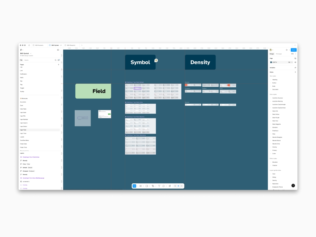


Ui video recording is the process of capturing a video of a user interface to document its functionality, troubleshoot issues, or create demos. This can include recording the entire screen, a specific window, or even just a region, and can be used for software development, user testing, and content creation. Yes indeed, most of the times video recording help peers to understand the visual logic, much more than a thousands words, as I'm keen on designing interaction among components
A Pattern stands for a repeated interactive model as a guide to be used across all the applications. By using the Pattern system, it is possible to quickly evaluate the application without having to process all the sections 1:1, as certain components (and interactions linked to these, together with others) are repeated vertically throughout the application. Pattern family falls under these categories: Interaction, Navigation, Motion, Layout, Communication . Each category has several sections such as: Common Actions, Data Table, Dialogs, Gesture, Login, Menus, Overflow Content, States, History, Configuration, Search, Semantic Index, Stepper, Transitions, Coreography, Animation System, Speed, Pixel Density, Spacing, Split Screen, Text Scanning, Confirmation & Acknowledgement, Disable/Offline States, Dashboard, Data Format, Edit Mode, Empty States, Help & Feedback, Imagery, On Boarding, Multi Brand


The Communication Pattern category expose a wide variety of interactions like multi brand, onbaording, skeleton, and much more. Speaking of Multi Brand, this is the fun part. If all the variables and tokens are properly written in Figma Modes and mapped across the entire set of elements, well then magic happens as Designer swap Color and Typography scale depending on the available brands. I even produced a video with motion effects applied to the brand Lumsa University to sell better the idea behind the Multi brand functionality
The Interaction Pattern category show reusable solution to common design problems that defines how users interact with an interface, ensuring consistency and predictability. These patterns describe the behavior and flow of a system in response to user actions and are distinct from a UI’s visual appearance such as data table actions, dialog implementation, common actions and much more
The Layout Pattern category reprents reusable and proven solution for arranging visual elements on a screen to solve common design problems, making an interface both intuitive and functional. These patterns guide user attention, enhance readability, ensure consistency, and improve usability by providing a consistent structure for elements like navigation, forms, and content. Common examples include the text scanning for text-heavy pages, elements spacing and much more
The Navigation Pattern category is a set of design elements and interactions that guide users through a digital product, like an app or website. These patterns provide structure and a consistent way for users to find information and complete tasks. Common examples include top navigation bars, sidebars, hamburger menus, tab bars and how they behave with one another anytime they are used simultaneously in combo mix called Configurations. Effective navigation patterns are intuitive and help create a positive user experience by making it easy to find content and move between sections.
Platform is a side library that I created to collect all platform user interface guidelines such as Web Apps, Desktop and mobile Operative System


Nexus is built on a detailed design language, which defines the core foundations of Nexus Design System like the grid, color tokens, and type tokens. Taking the time to explore the design language blueprint documentation give you a deeper understanding of the principles behind Nexus's design philosophy, helping you make more informed decisions in the product work. For developers, learning these foundational elements is a smart investment. When you learn to use foundational elements like the grid, colors tokens, and type tokens you will reduce the need for custom CSS, speed up implementation, and help maintain a consistent Nexus brand experience across products—all while making future upgrades easier.


With this being said, there's more than the digital implementation of Nexus Design System and I'm speaking of an Angular based library with Storybook. Here, along with developers, I translated all the variables I created previously in Figma in the form of primitives and tokens, so that Design and Develop speak a common language with the final result that every element developed matches the design plan


Definition stand for the process of making a design system accessible to others by publishing it. Reason why I created word documents, wiki pages, prototypes to express criteria, theming and multi brand. It's even possibile create dedicated websites and why not a virtual assistant that help viewers and peers to understand and make use of it
A Ui template is a pre-designed layout and style guide that standardizes the appearance of user interfaces, ensuring consistency across a project or product according to Nexus Design System. These templates act as a limited pages, containing reusable components like buttons, navigation, colors, and typography, which can be easily applied to different screens or pages. They save time by providing a consistent starting point and making it easy to update a look and feel in one central place.


Nexus provides a Symbol centralized Library of reusable components, styles, and assets that can be customized with brand-specific themes, such as different colors and typography, to maintain both consistency and unique brand identities across various products. Yes indeed, nexus has been already applied to brand like Lumsa University


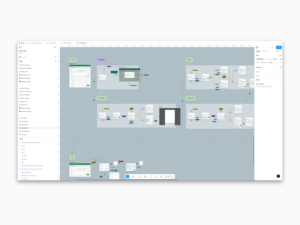


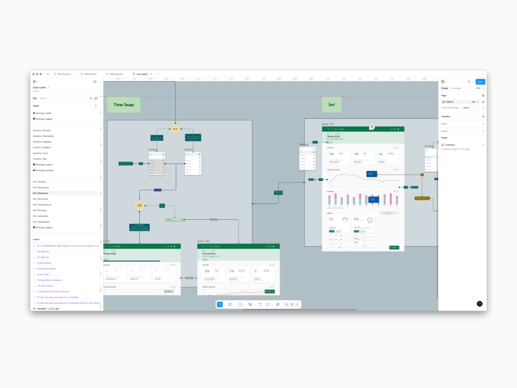

The set of modules of Nexus Design System can be collected in a documentation for information consultations accessible to everyone. In case the content is imported within a web portal instead, well then chances are that blueprint can include not only interactive simulations (Live Preview) with code (Storybook) of each component, but also Metric inspections of each component (Symbol Library). Whether it's a web or static delivery, content goal it to facilitate both understanding for non-experts like stakeholders and implementation for Designers and Developers


Nexus is a useful solution for designing and managing a consistent, scalable, reusable, and updatable design architecture. Matter of fact, the Design System must become a common goal within everyone's reach, allowing everyone to participate in the design process. Therefore, it is well known that the Design System is not a project in the hands of a single individual (the Designer), but rather a synergy between all peers including Stakeholders and Developers, reason why the Blueprint can be delivered in other forms like a Wiki written with markdown code.


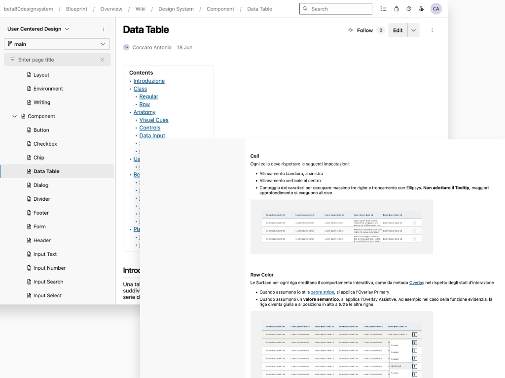


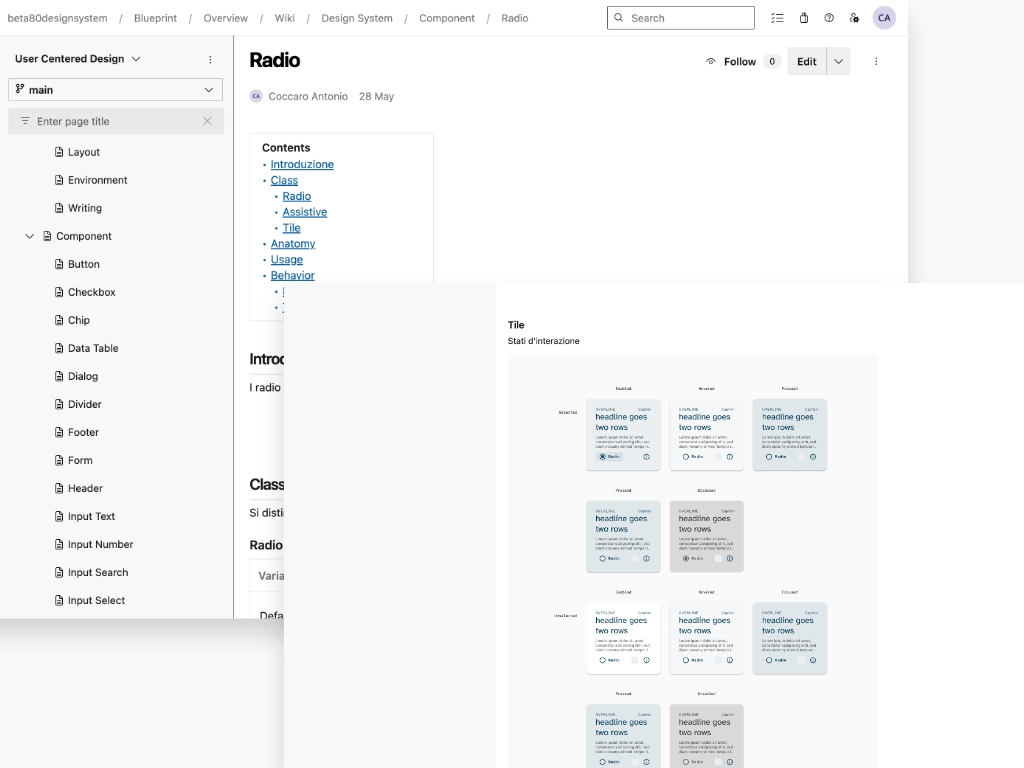


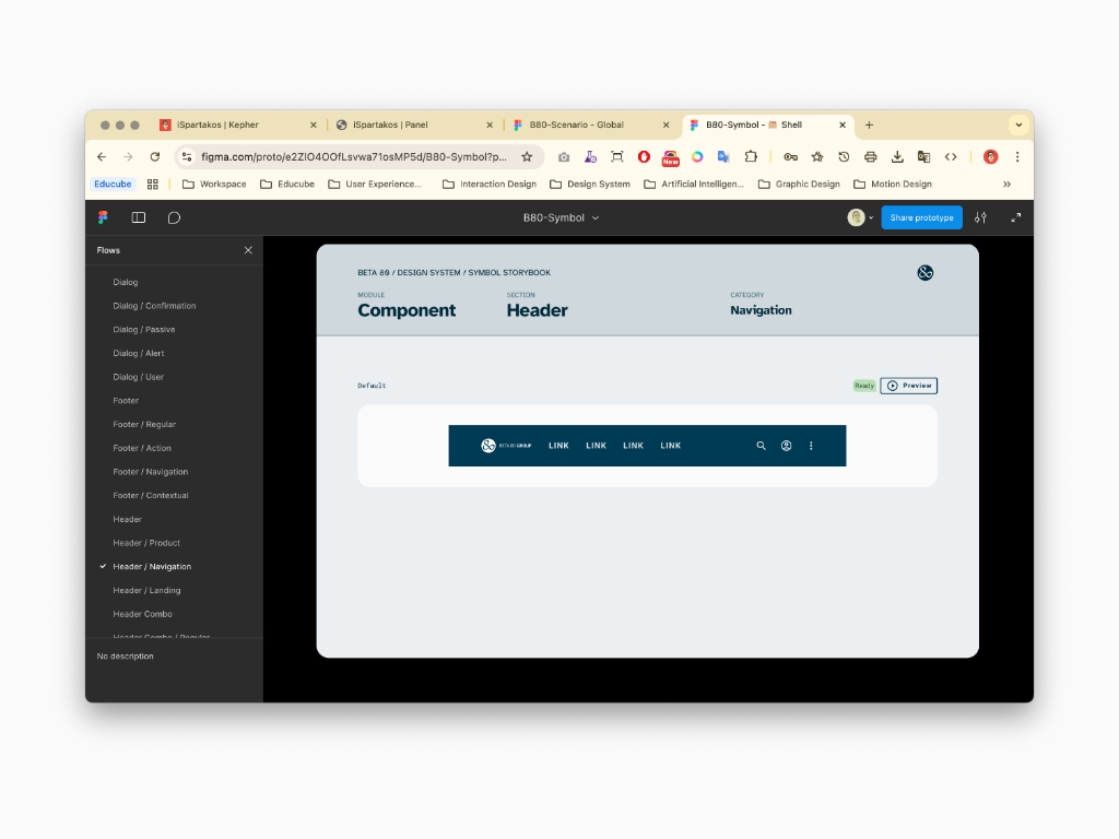
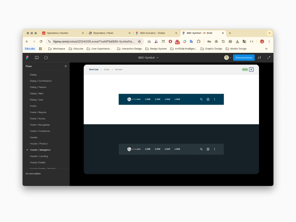
Besides a proper documentation, whether it's written in Word or created as a web portal, the Symbol Library of Nexus must be visible to Stakeholders, Developers and Designers. In fact, just like the Angular Library available via Storybook, it's possible to explore the Symbol Library via Figma prototype. I produced a Scenario Board to collect all the pages for each category and section that not only visually explain components, but also allow viewers to interact with them


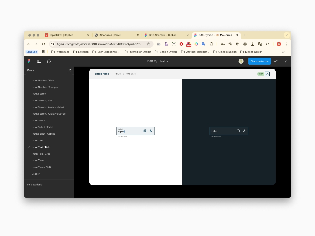




Nexus provide Designers with a web or native app flow ready made based on Templates. Among the benefits, you can find not only consistency to ensures all parts of an application or website look and feel the same, but also efficiency to speed up the design and development process by providing a reusable foundation. Not to mention that others advantages are maintainability that allows global changes to be made by updating the templates, rather than editing each individual screen. Also, the standardization helps to impose a consistent brand identity across different parts of a project.
Nexus has been deployed to Nexa, a web app product that provide customers with a virtual assistant


Nexus has been deployed to Educube as well to provide customers with a wide range of university services unified under one and only web app product


