
I'm moving this project from Adobe to Figma!
In fact, the idea behind a Design System is giving a solid point of reference to promote and produce a better design across a variety of digital web or native app services. In order to achieve this result, the Design System is divided into modules Principles, Foundation, Patterns and Components.
The term Architecture Design means the "DNA" of the set of interfaces, both present and future ones, with a view to perpetual support to correctly modulate the set of services provided in the Unicatt world (or even for example Educatt and other satellite sites). This in fact determines a continuous intervention of the IXD material in the life cycle of Cattolica products for the purpose of design and / or additions and / or maintenance. This type of Architecture is designed to create a base or matrix such as to be able not only to manage the visual of current services (web or native app), but also to integrate future implementations. Doing so, it's possible to avoid not only visual discontinuity and / or incompatibility of interactive experience, but also starting off a design from scratch errors free.
For the entire duration of a product life cycle, the Design System is a never ending stage handled by a Interaction Design who translates a digital service into a modular Design Architecture. In fact, a series of perimeters were defined ranging from the Principles to the Foundations and from the Components to the Patterns in tune with the progress of the product over its lifetime and technology evolutions. Therefore, the Design System stands as on-going-work within the UCD framework of process.
The inclusion of Interaction Design, and related Design stage, in the design life path of an application, is a crucial key factor for a better usability and accessibility. In fact, The Interaction Design is the gear that intervenes between the User Experience Design and the Development in order to help the former in translating concepts into usable and digestible interfaces along with the technology evolutions and the latter in building the code architecture with clean and clear usable user interfaces.
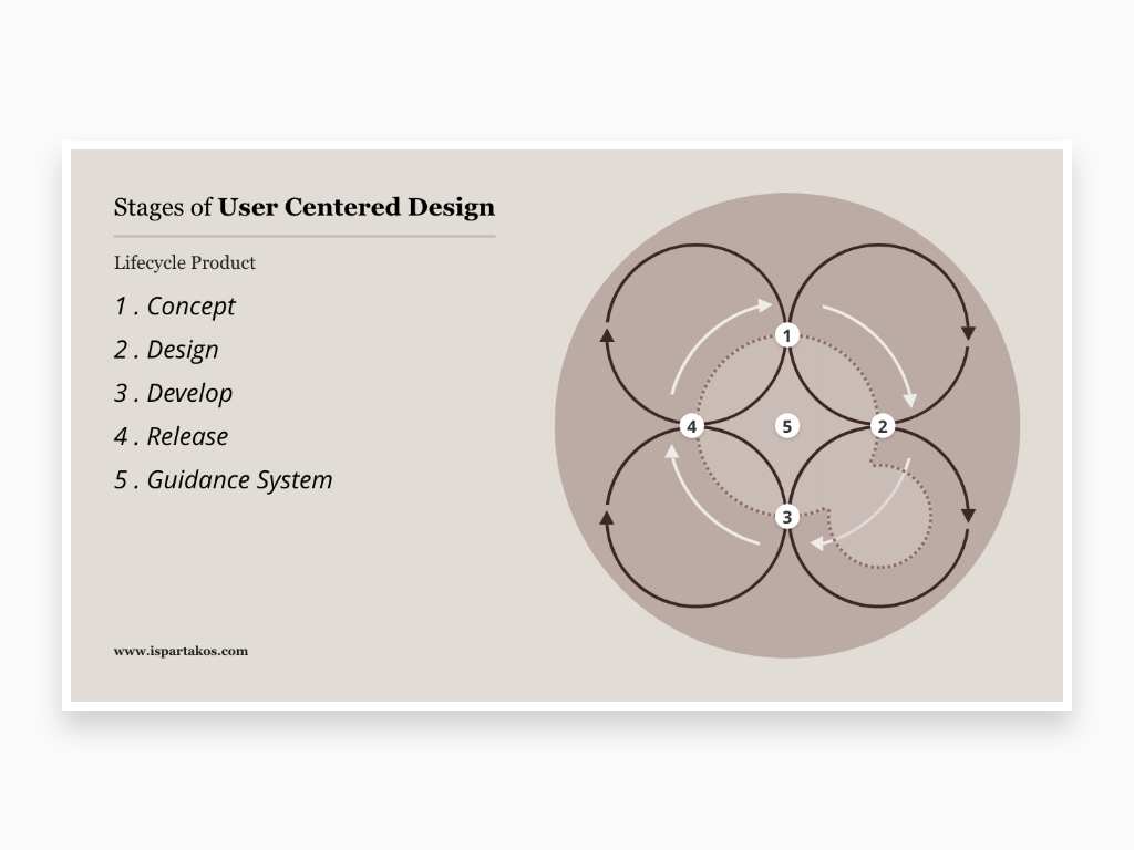
User Centered Design (acronym UCD) is an approach for product development that focuses on the end user, Product Development Life Cycle of B2C and B2B services in mobile and web apps. For this purpose, various professional figures such as User Experience Designer, Interaction Designer, Developers and Project Managers apply iterative Design with techniques, processes and methods during the life cycle of a product divided into Concept, Design, Develop, Release and Design System
As for the Prototyping working process, even the Design System provides a from Abstraction to Definition methodology. This can be summarized within an iterative and cyclic vertical scheme. Each processing layer is designed to create a system that can define every single aspect of the interface based on the rules of usability, accessibility and experience in the field. Yes indeed, the Design System involved a deep analytical study and a complex execution to design, not to mention that I could set the foundations of a new technical and methodological design process


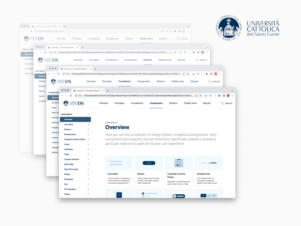
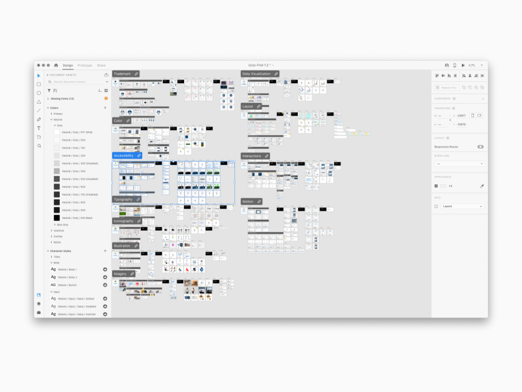
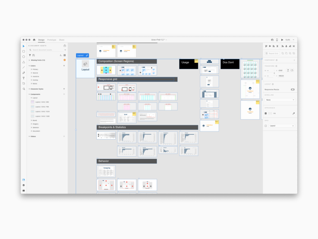
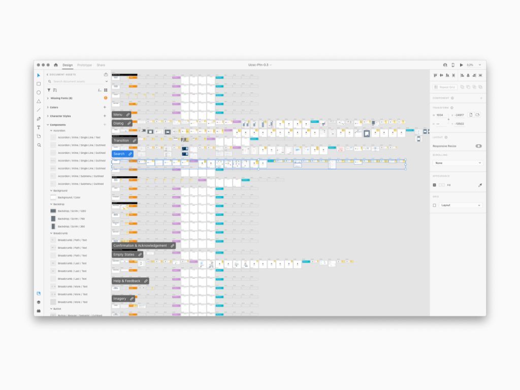
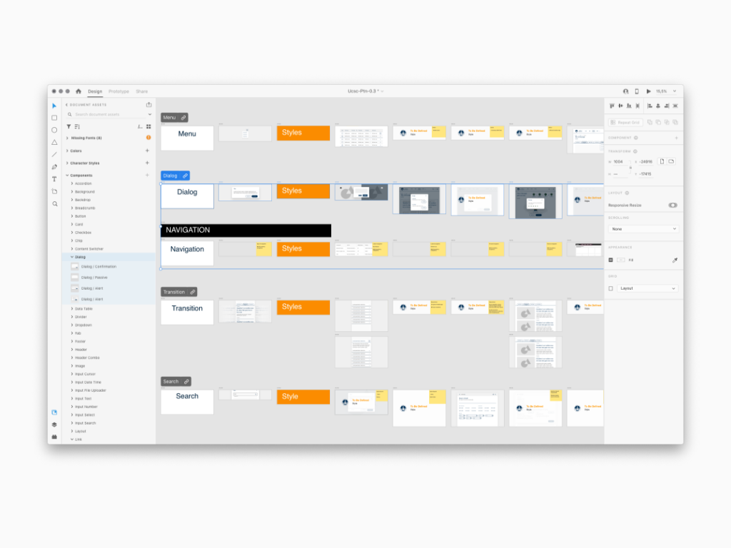
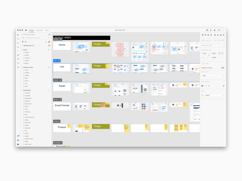
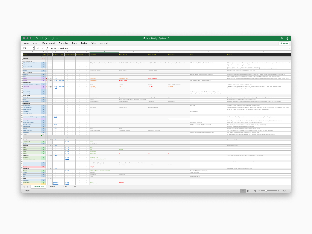
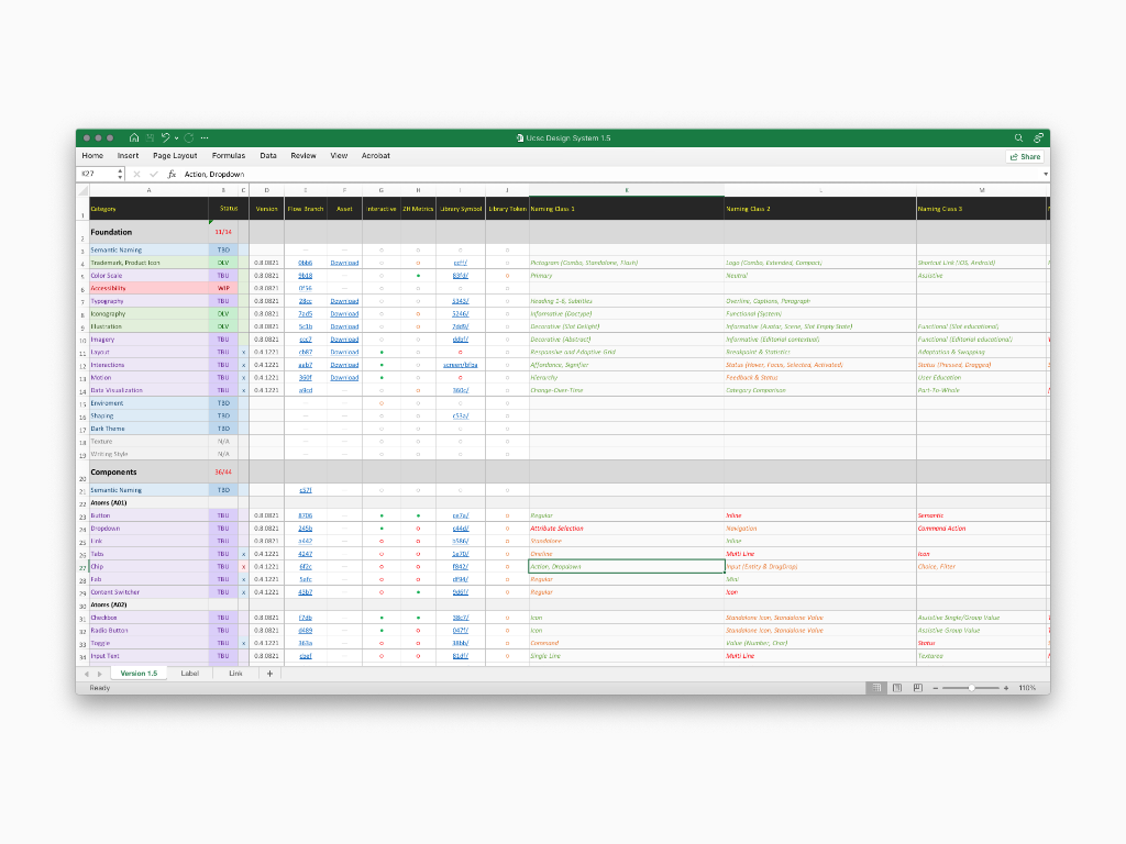
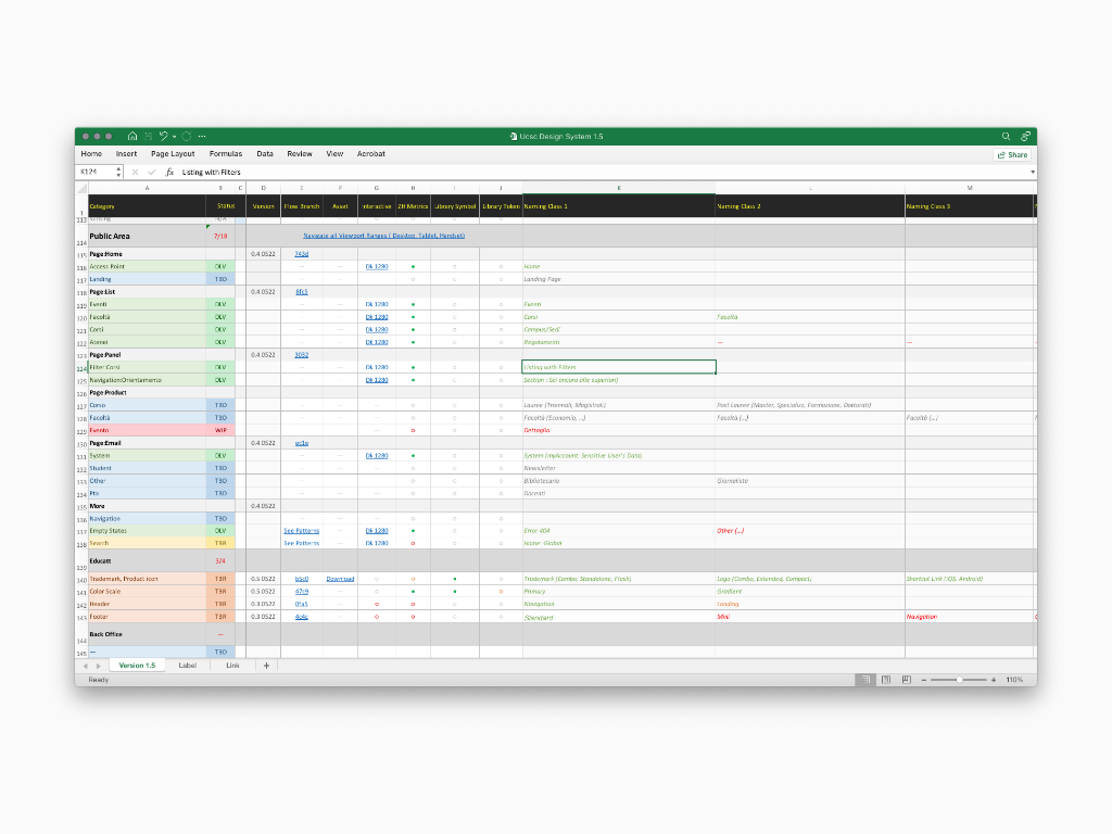
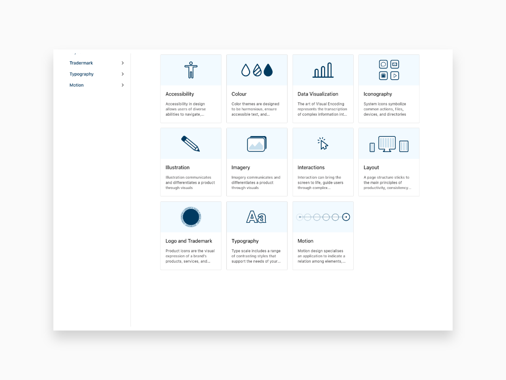
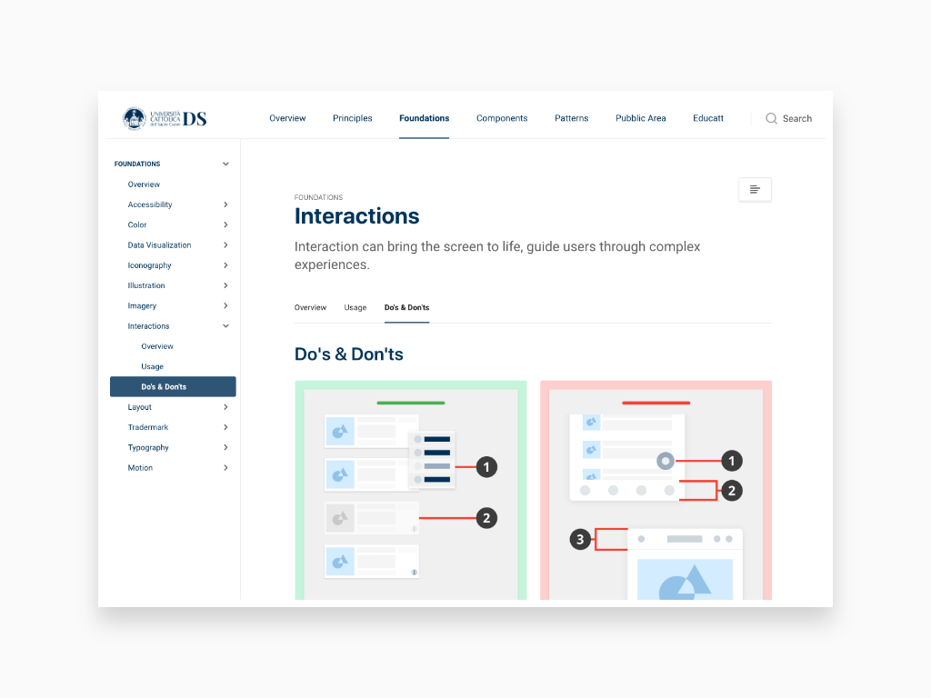
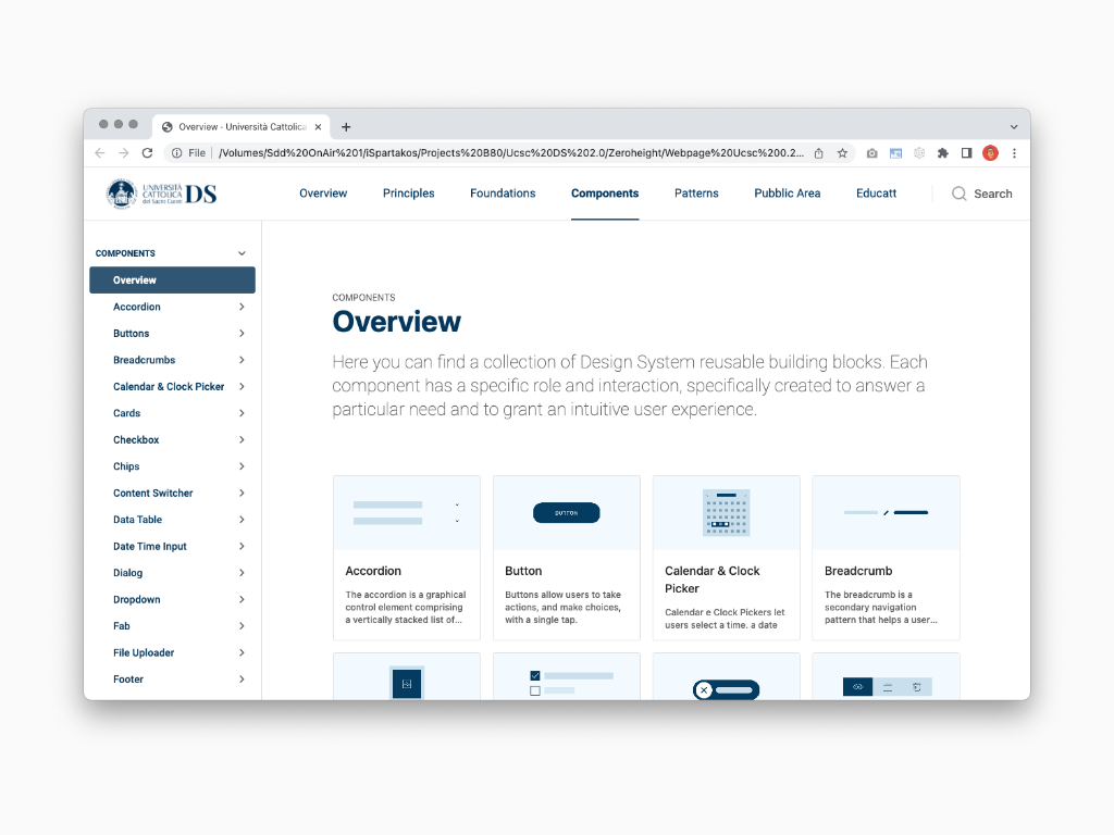
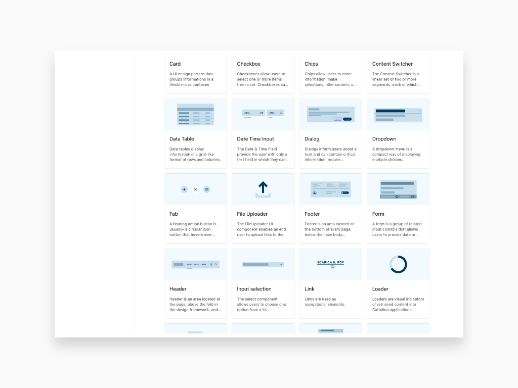
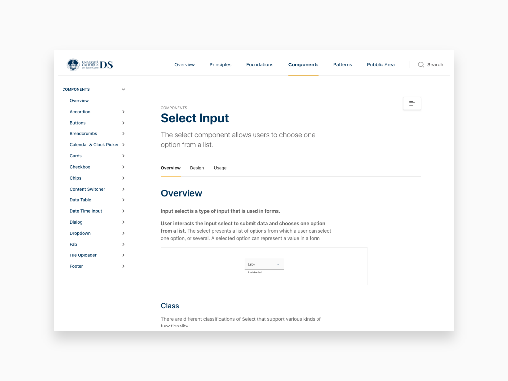
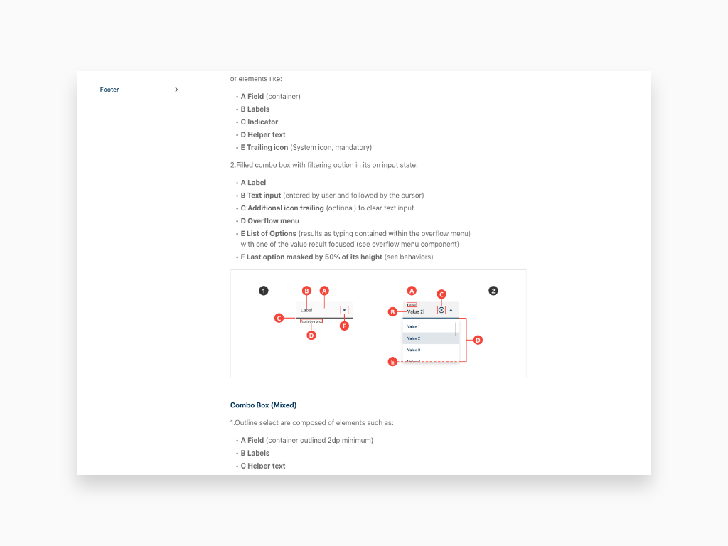
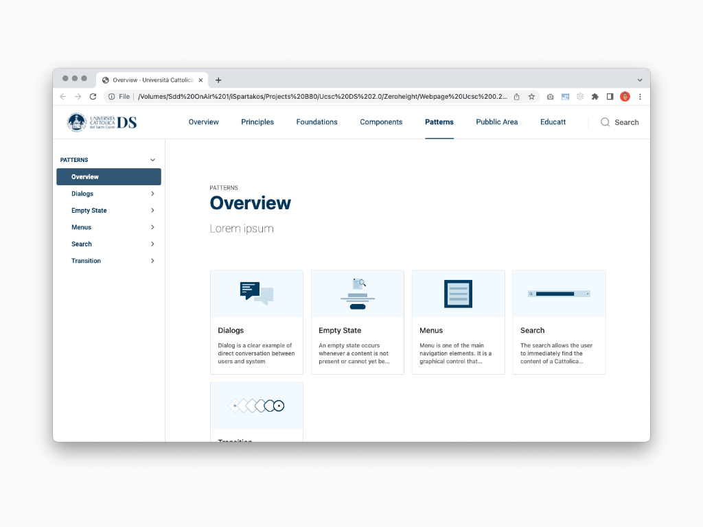
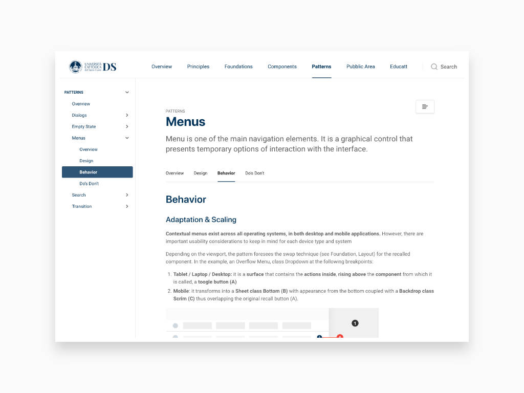
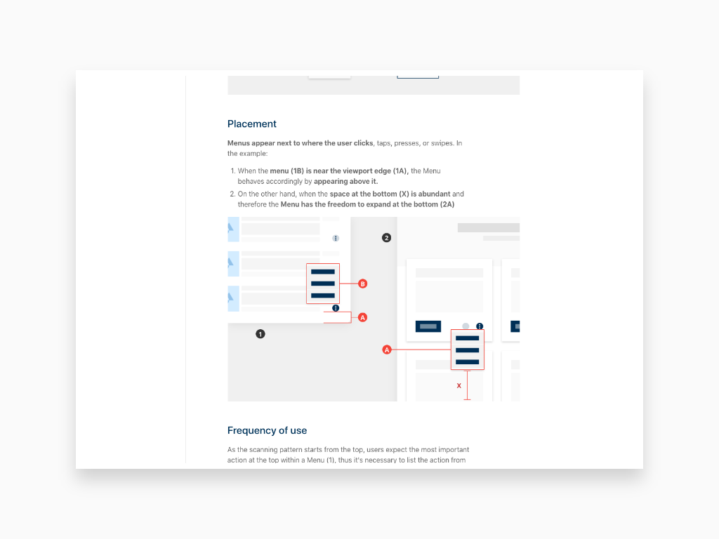
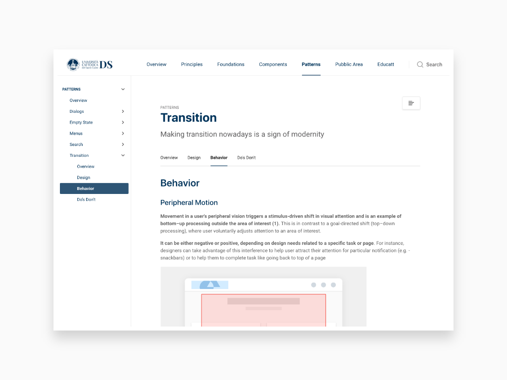
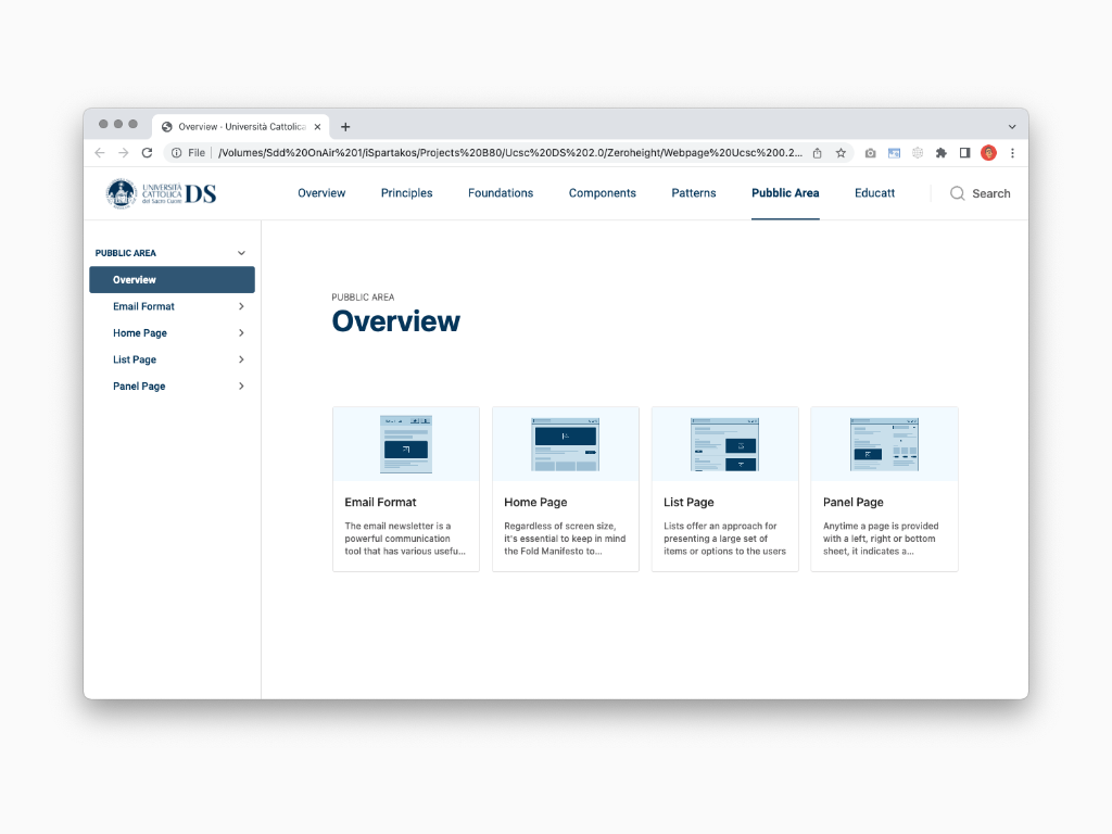
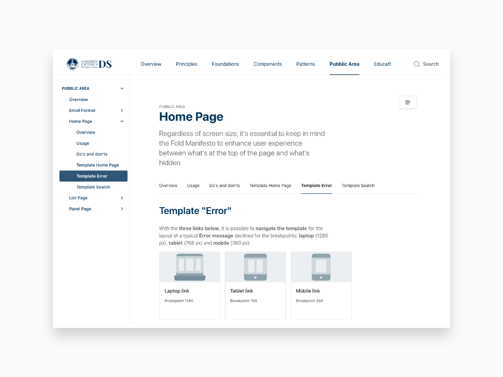
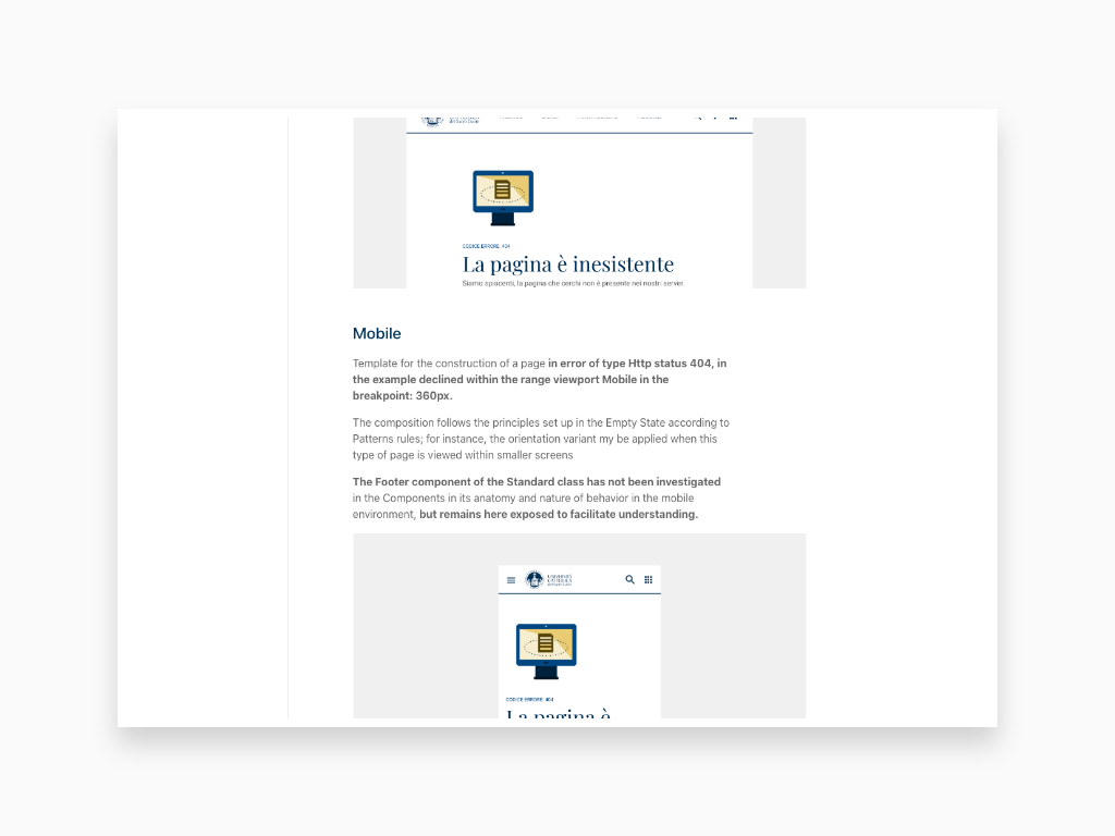
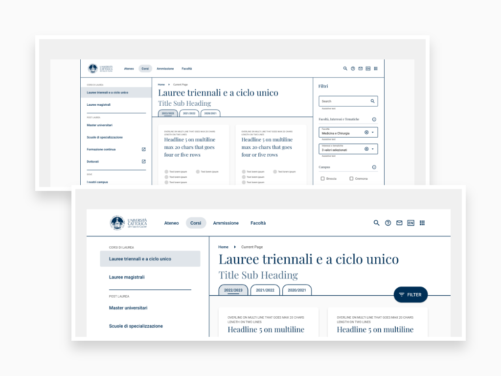
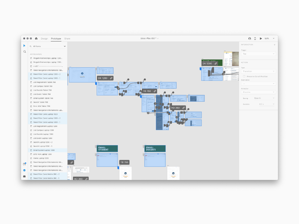
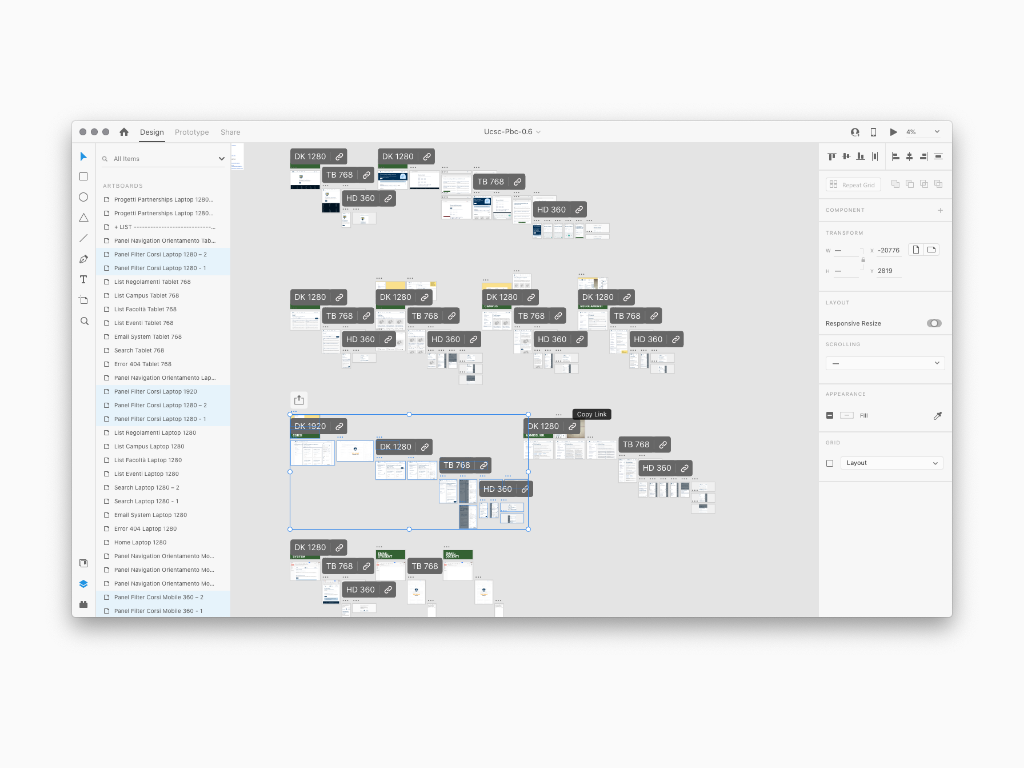
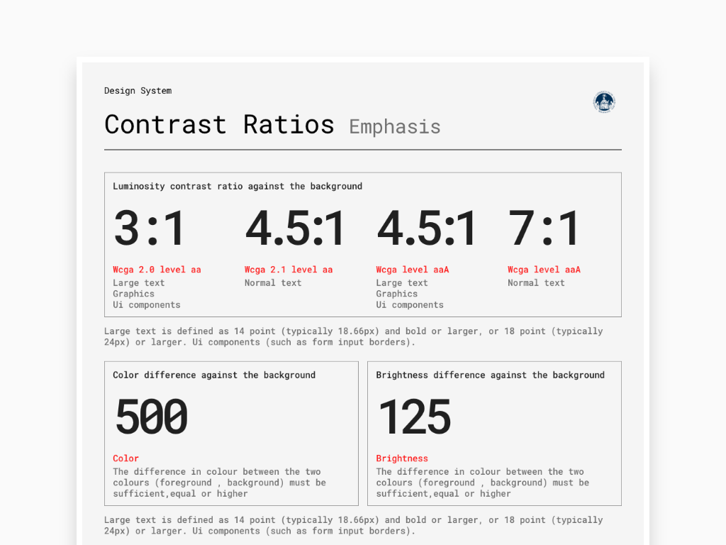
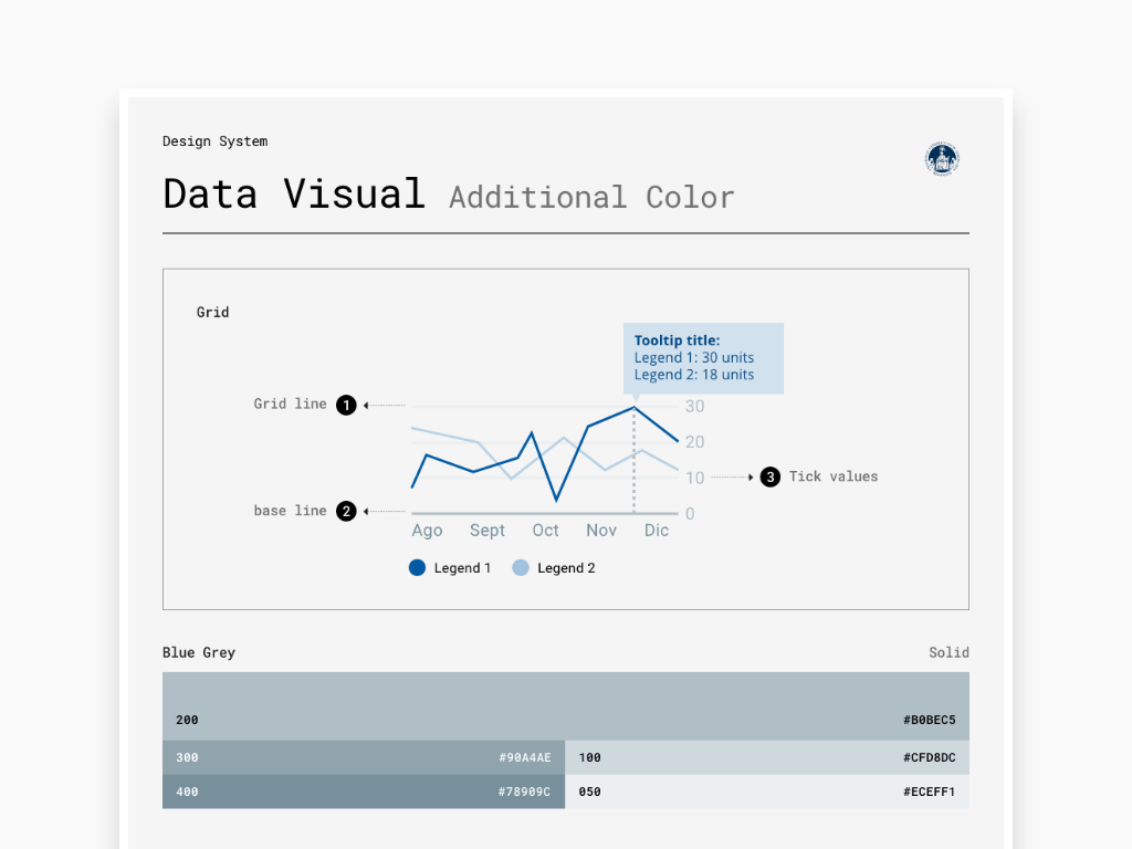
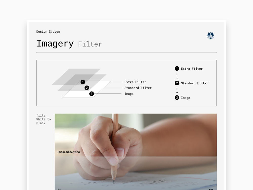
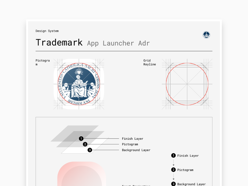
Here I conceived and produced a massive set of artboards on a dedicated canvas. In this area, the basic rules of a design system are studied and designed. Here I conceived and produced a massive number of Components in the form of Ui Flows to show the anatomy, style, behavior, usage, dos&don't, placement of every single Building Block element from the smallest atom like an icon to the biggest shell like a header. Also, I applied the same process to the Foundation to express the basic and advanced rules to follow according to Trademark, Color, Accessibility, Typography, illustration, Imagery, Data, Layout, interactions, Motion, etc... Same thing for the Pattern Ui Flows to collect a series of repetitive actions across the Design System to be applied later on every Cattolica web app or native app, for example Menus, Search, Dialog, Transition, Navigation, Interaction, Navigation, Communication. Finally the Public Area received the same design approach including Ui Flows that shows logical group of page templates such as login pages, pages with side panels, pages with listings, detail pages, email formats, search pages and much more.
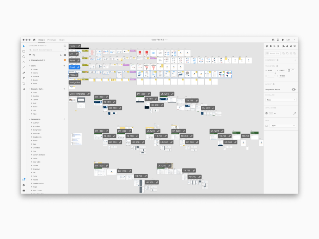
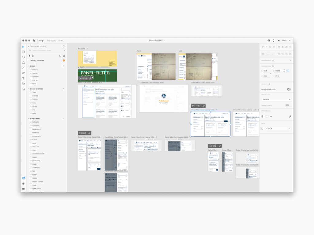
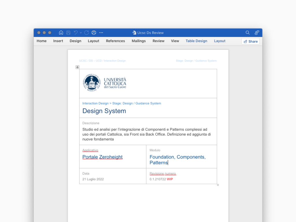
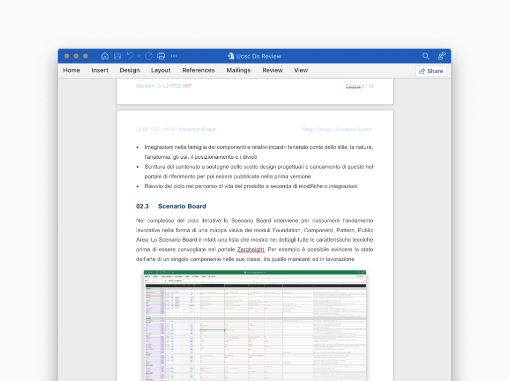
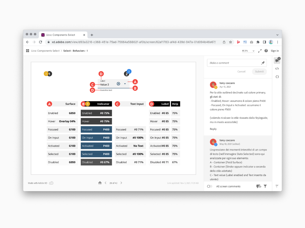
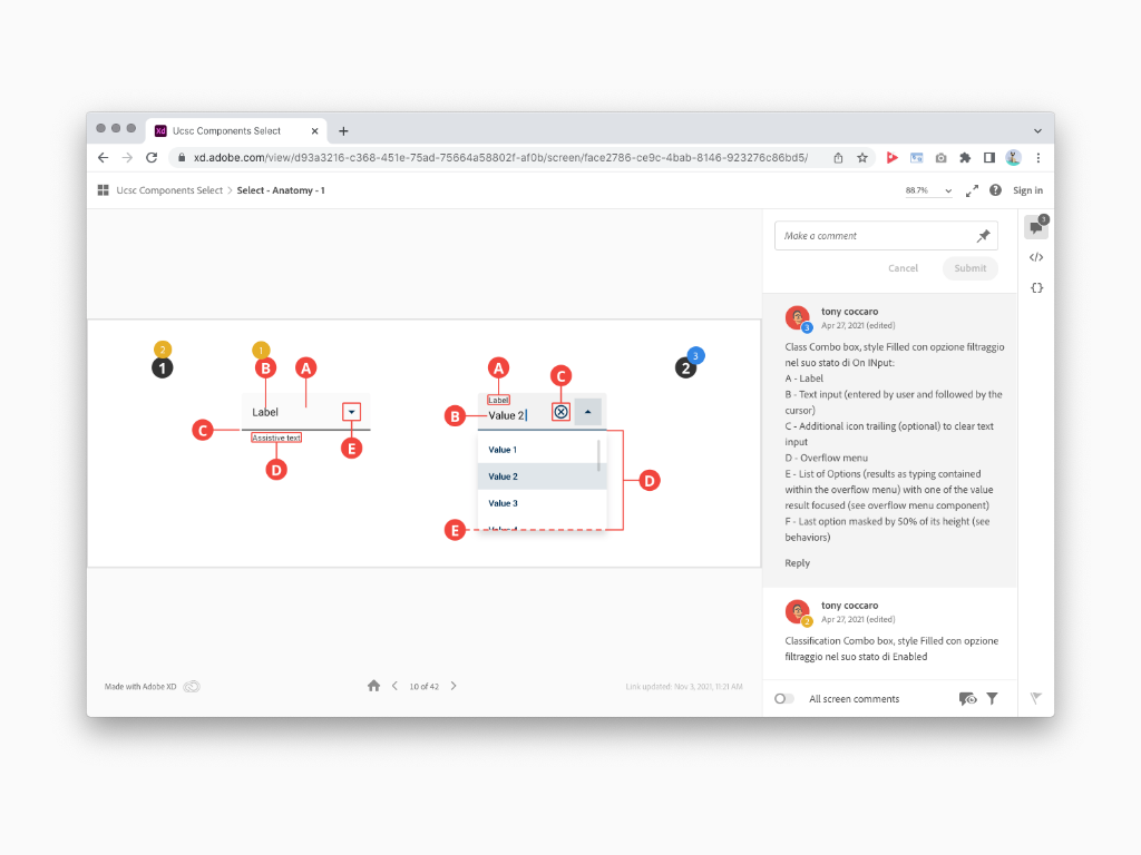
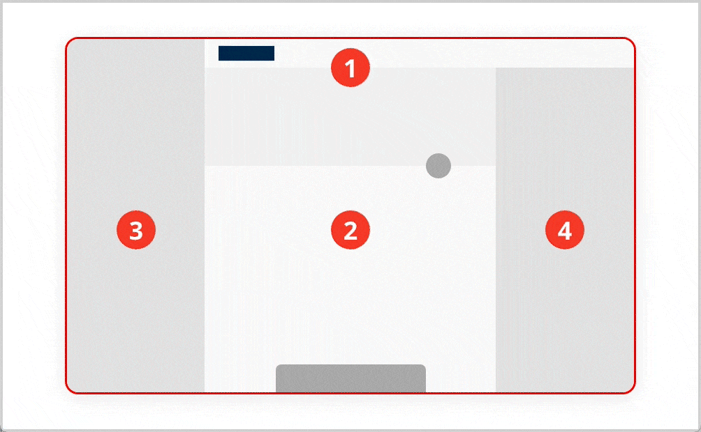
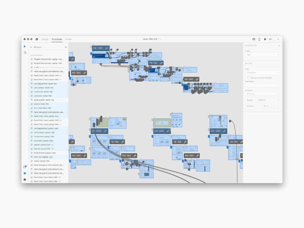
Next, the design method required the setting of a Scenario Board to collect, and later on manage, the complexity of a Design System including Foundation, Components, Patterns in the form of a visual map. As a matter of fact, the Scenario Board is a very long list to dig in every single design feature, like for example defining class semantic naming or writing about Ui shell, molecules and atoms usability concept and technique. Every Ui Flows were accompanied by explanatory notes in order to facilitate the understanding of Design strategies in terms of usability and accessibility rules in tune either with the Cattolica brand identity style and the technology evolution. A similar writing work was preparatory to the transposition into the final navigable content via a web portal
The Scenario Board includes innumerable Flows navigable online and indicating all the specifications accompanied by explanatory notes. Most of the time I could apply my past Front End development knowledge to make sure the building blocks could be done with no risk involved
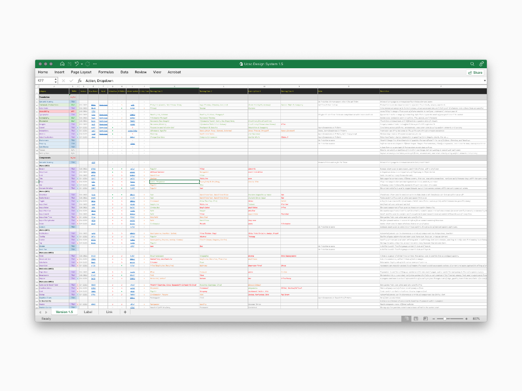
Once the content above was reviewed and approved, it could have been uploaded into ta web portal. All of the Foundation's evolution has been channeled into a web portal which was designed specifically to distribute concepts and resources useful for both understanding and implementing the Design System (e.g.: Token Live Preview or Storybook Metrics). A very careful transposition process was undertaken to upload the Scenario Board Ui Flows in the form of text along with static (and in some cases also dynamic) images to further facilitate the meaning.
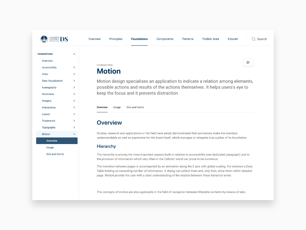
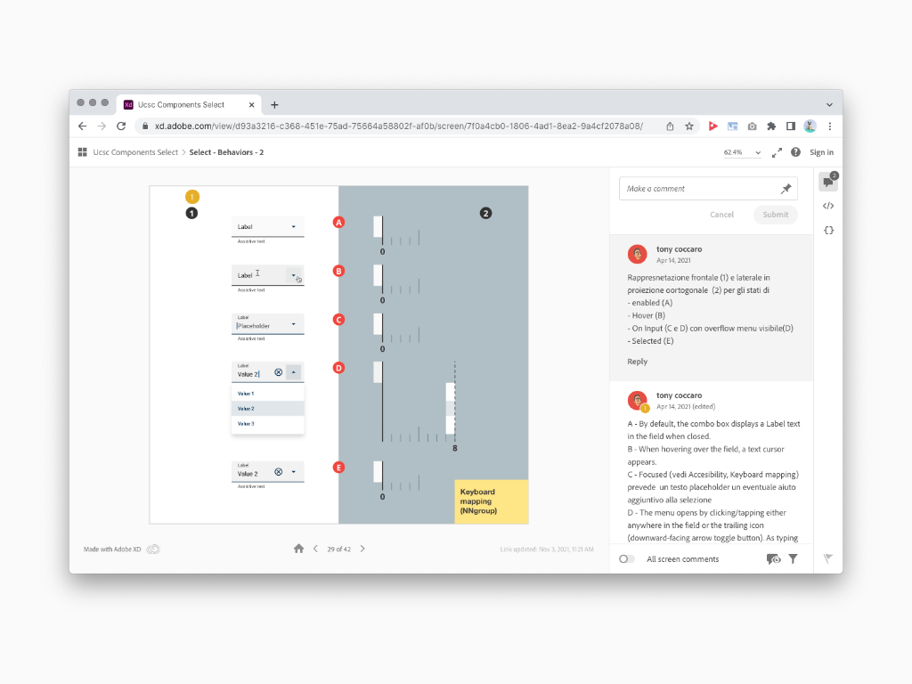
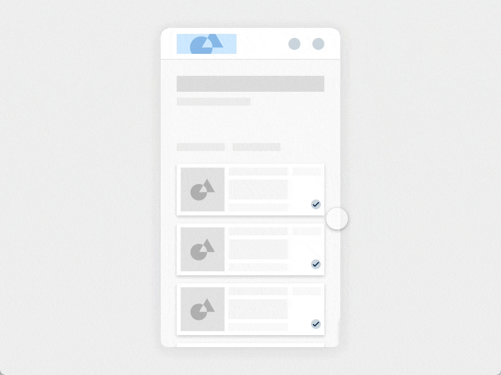
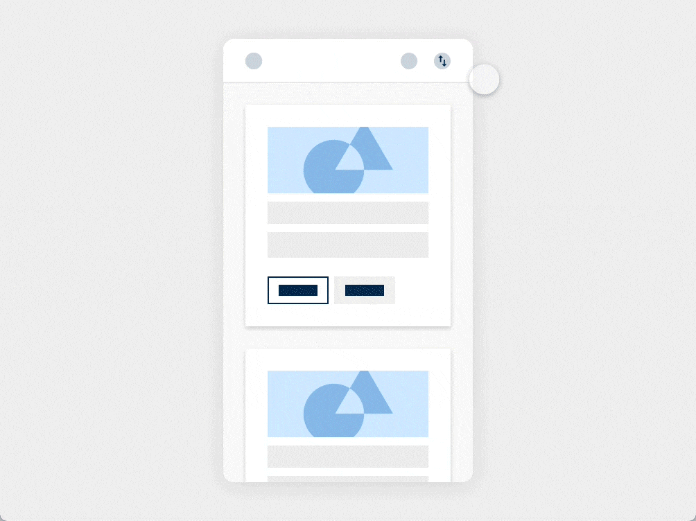
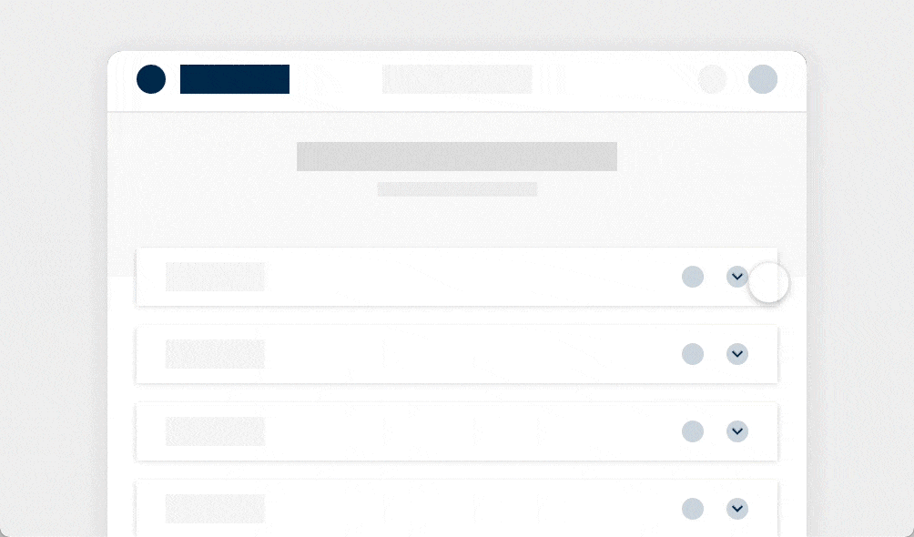
In order to help understand better the concepts expressed by a Design System I conceived and animated a long list of images. For example the Motion section included most of them to give a better insight about the components behavior (choreography) within specific contest
Each animation is the result of me interacting with the elements (clicking, hovering, dragging, keyboard mapping...). Most of the time, for explanatory and technical reasons, I didn't use the real components dynamic symbol. Instead, I conceived and designed a parallel Library of Components in the form of Wireframe to be used as placeholder instances.
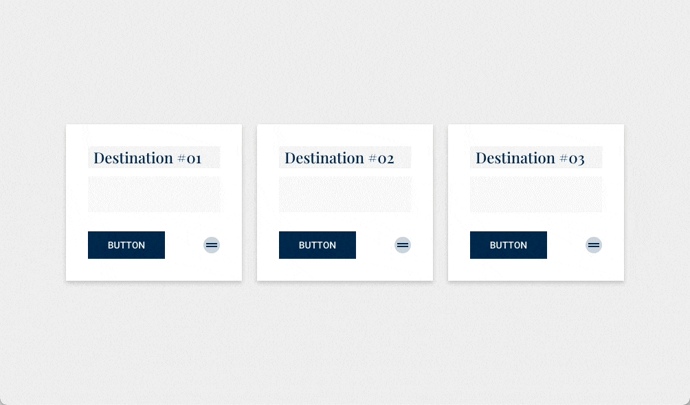
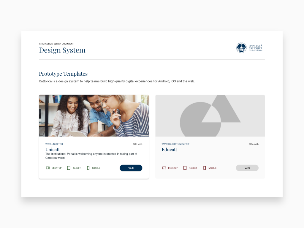
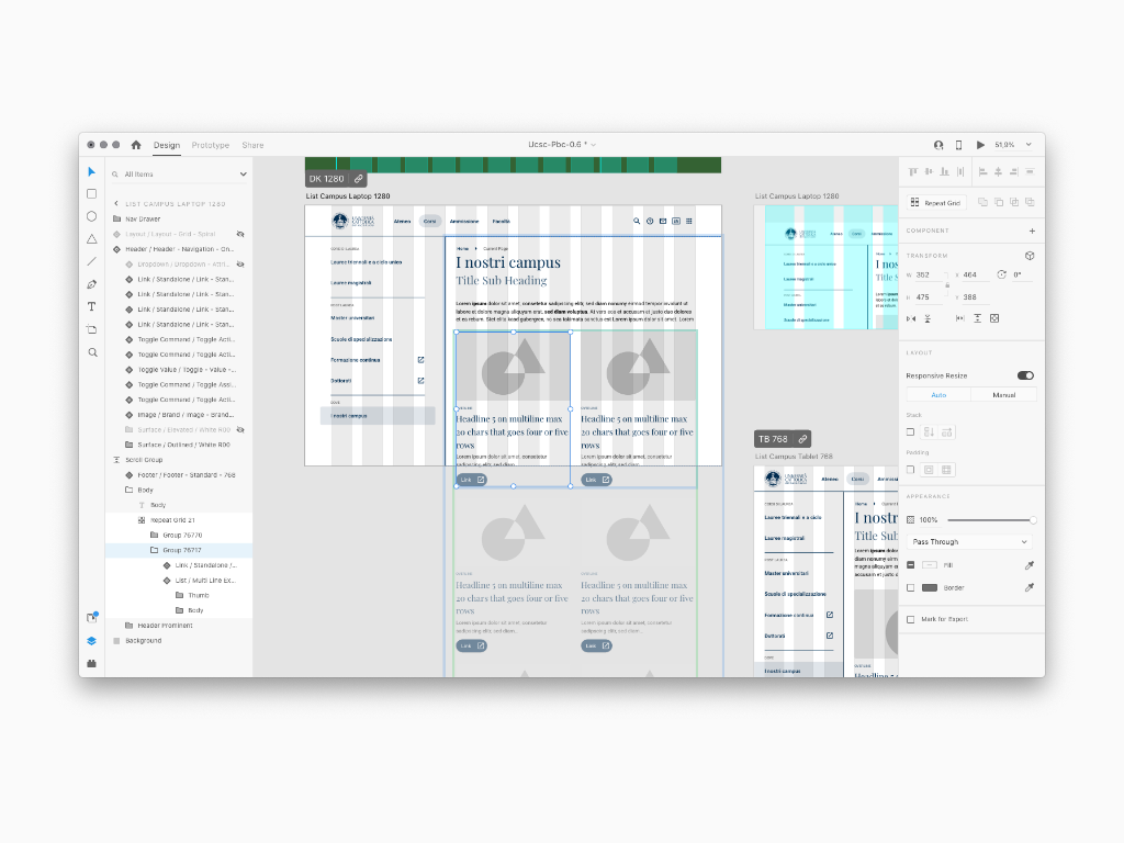
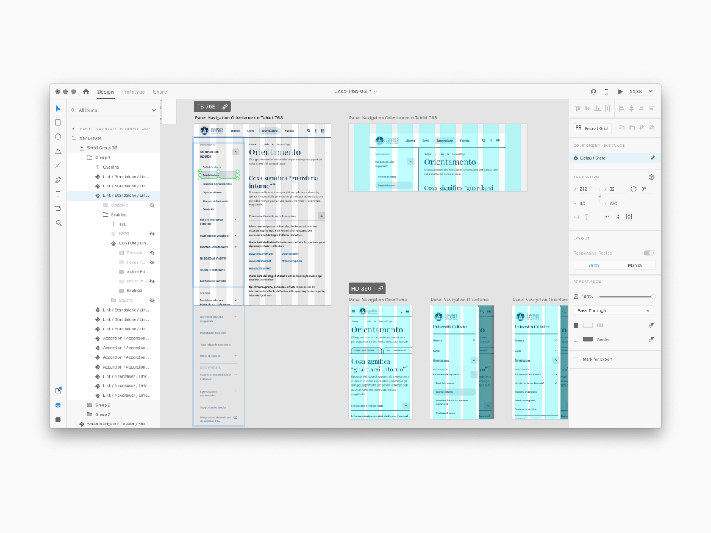
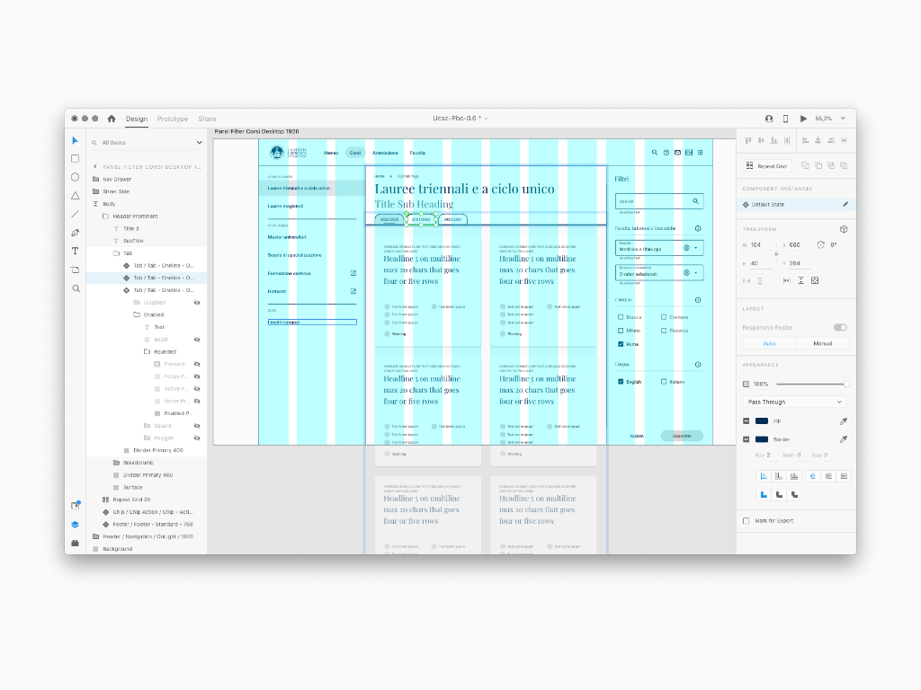
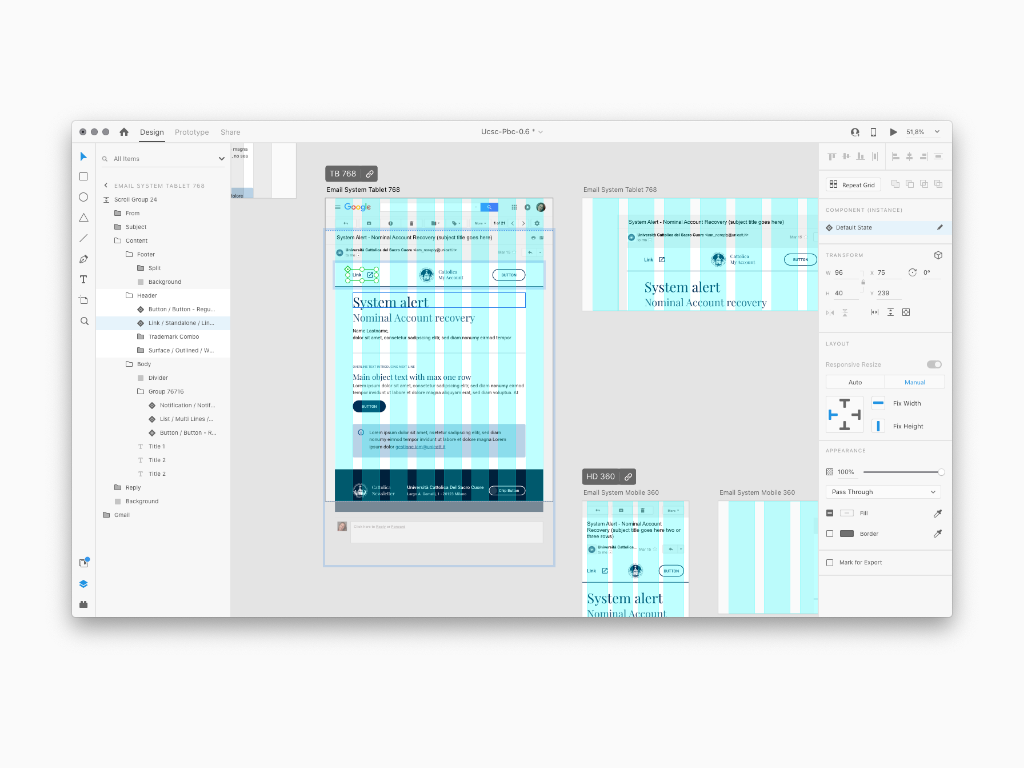
This area displays a list of sample prototypes grouped by type of use, designed for the Cattolica customer and in line with the rules declared between Foundation, Components and Patterns. A similar approach was mandatory to help deploy the Design System across the Cattolica portals; in fact these Templates could favor the Design hand off process to the Development. Since the design System is an innovative project for Cattolica, it was necessary to educate either the operative and the administrative staff to help understand better the rules set out in the Foundation, Components, Patterns and Public Area sections. most of the time I could apply these rules acrsso Cattolica Portas I was in myself. At the same time, a similar design process was also commissioned by the partner Educatt and in this differentiating some parts of the Foundation and Components to avoid a brand identity conflict

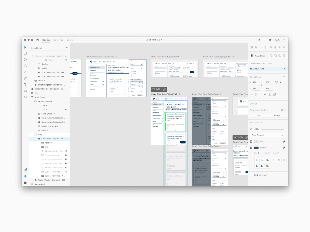
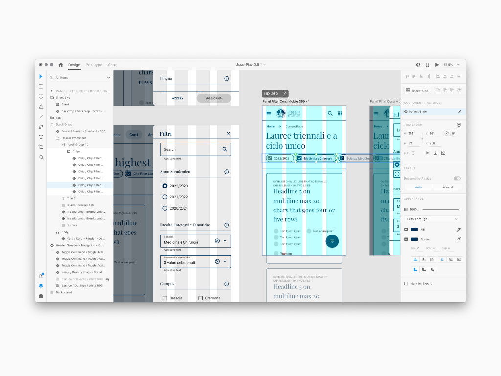
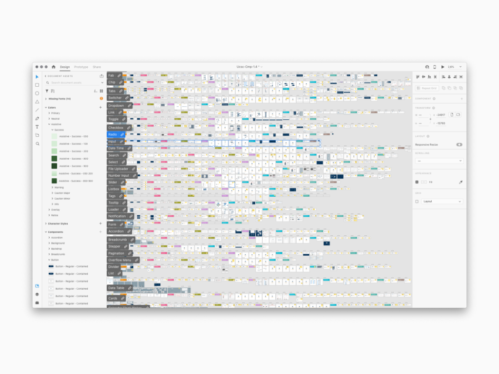
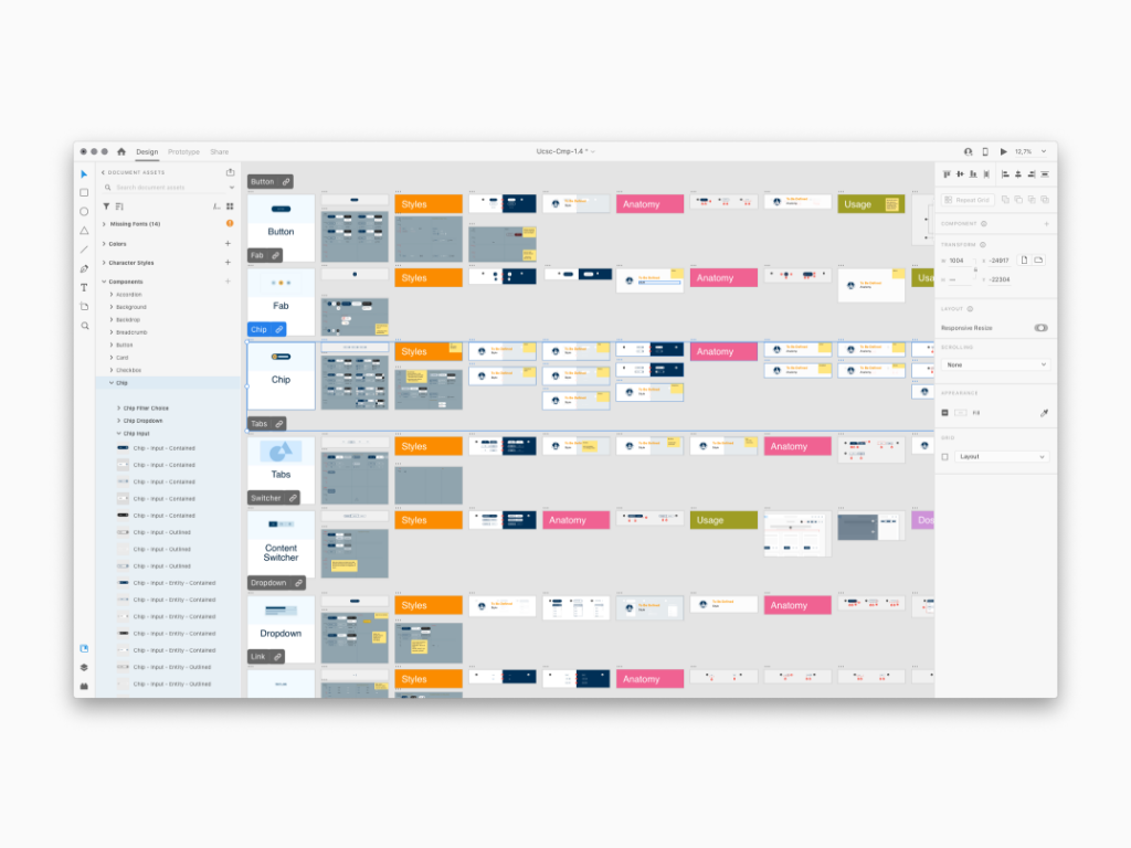
The combination of Foundation and Components generates a User Interface library of symbols, also known as a Storybook including a big set of components (divided by Shell, Molecules and Atoms) carrying all the Foundation and Pattern rules. A storybook is a design tool ready to be used by Interaction Designer either for design execution and developing a similar Library in the form of Token along with Developers.
Sidenote: the obsessive care for each component, including a weighted semantic naming, was mandatory for a successful first Ui Library version
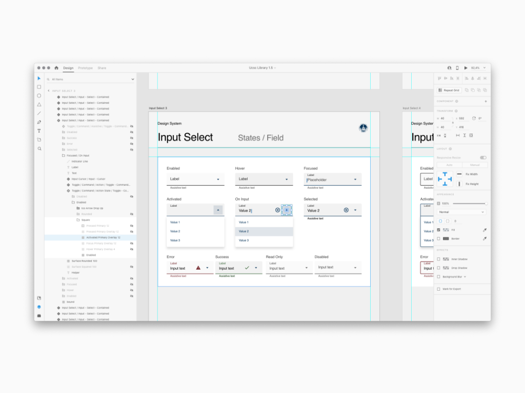
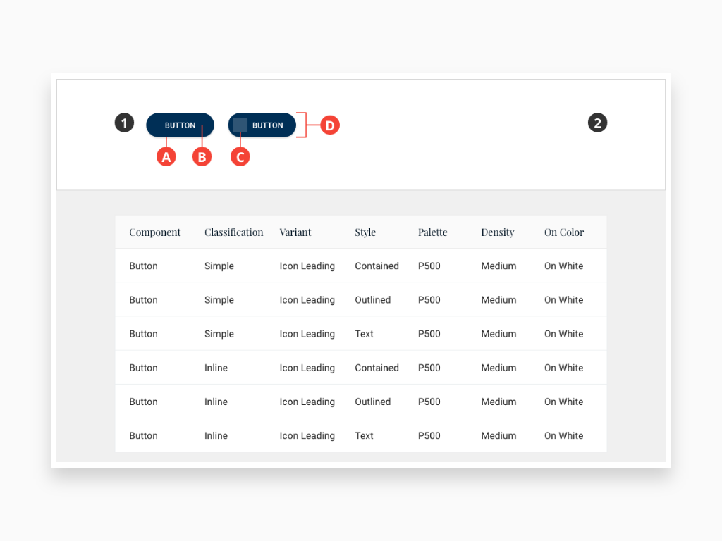
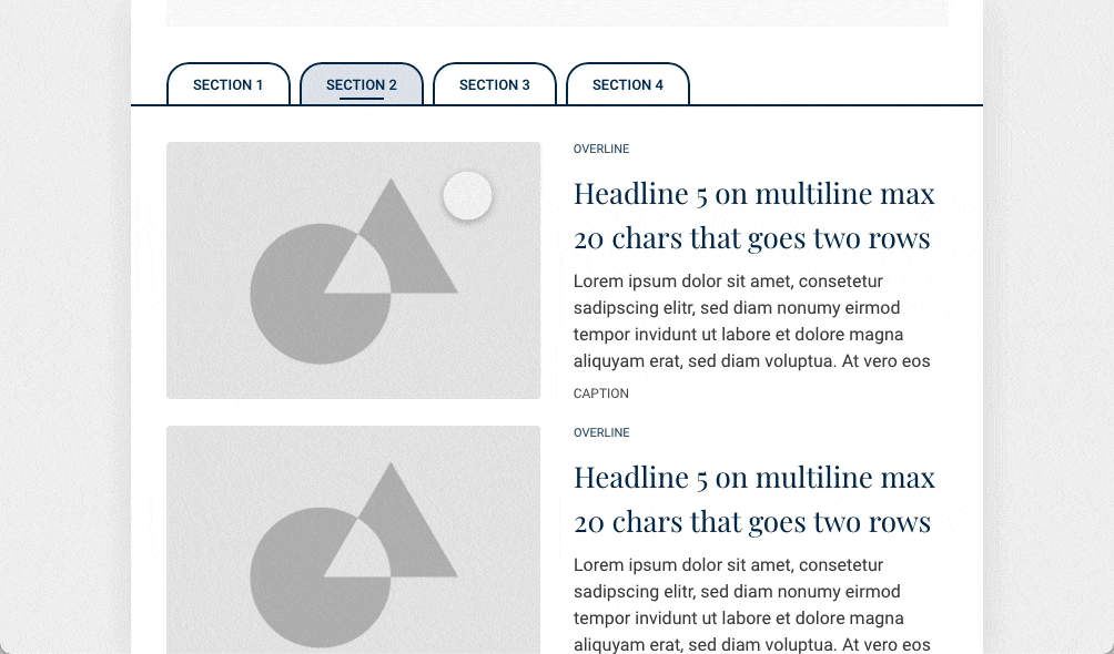
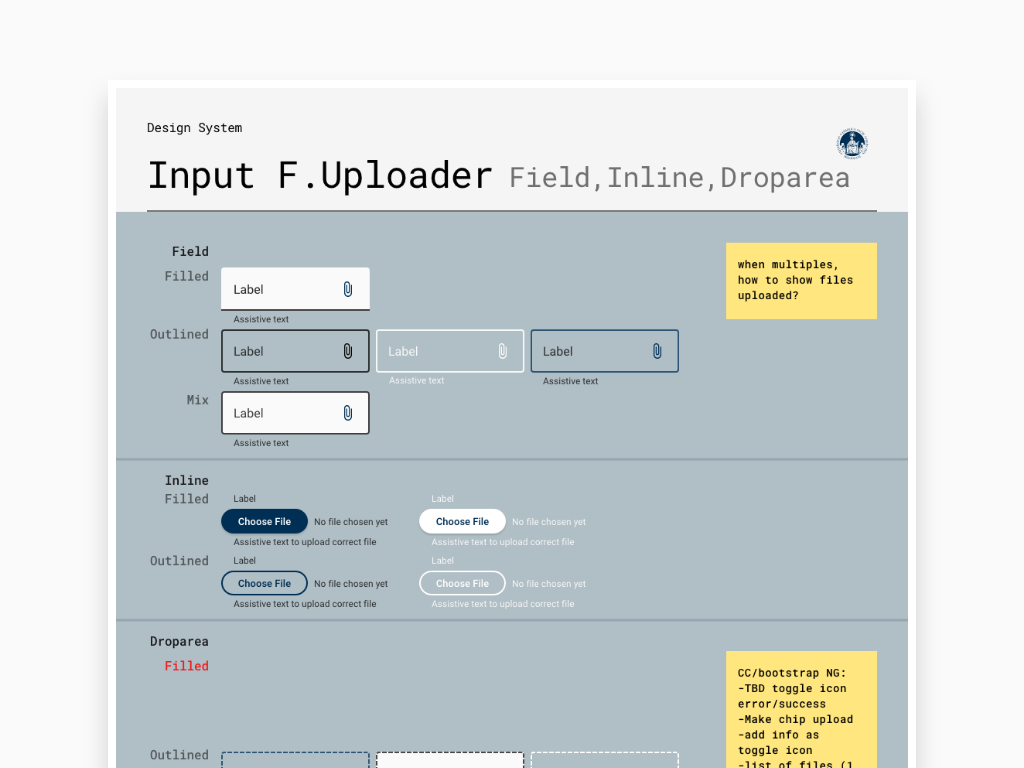
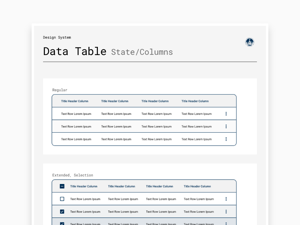
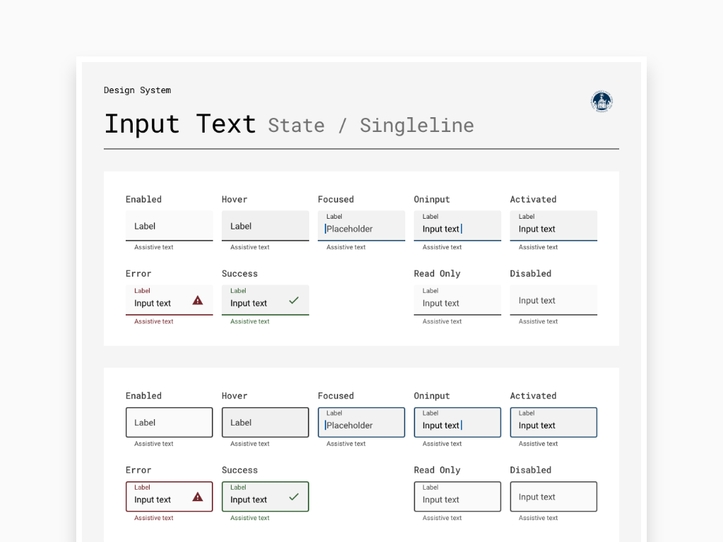
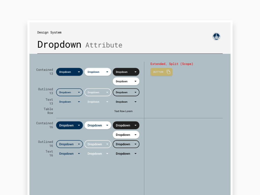
See images down below to get an idea of what the Storybook looks like. I took a random and small amount of symbols. Every single detail has to be pixel perfect for different reasons such as previewing the metrics, applying responsiveness, setting the interaction states and so on. This way the Library can be uploaded and share with other Designers to keep the Visual Design consistent across all the projects
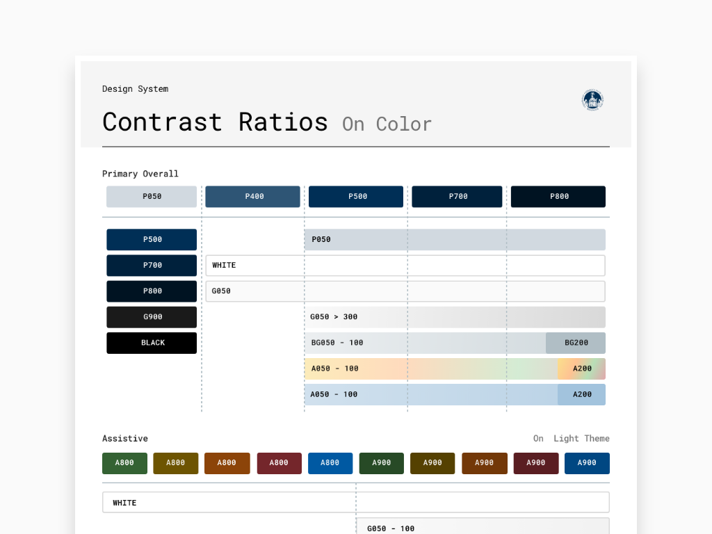
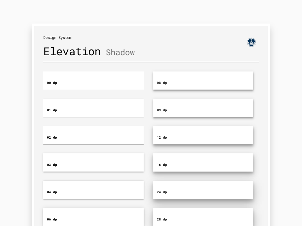
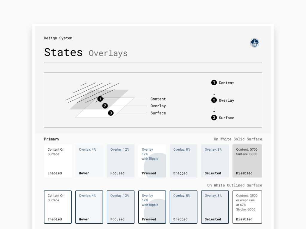
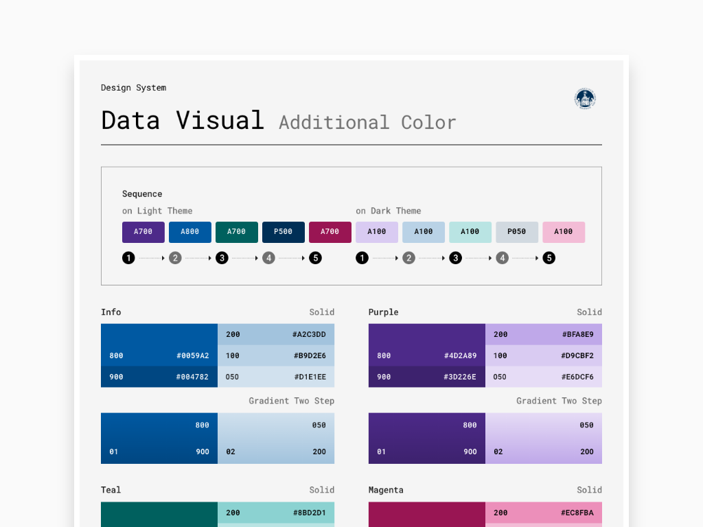
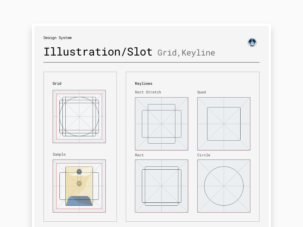
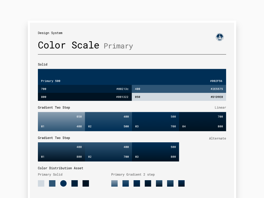
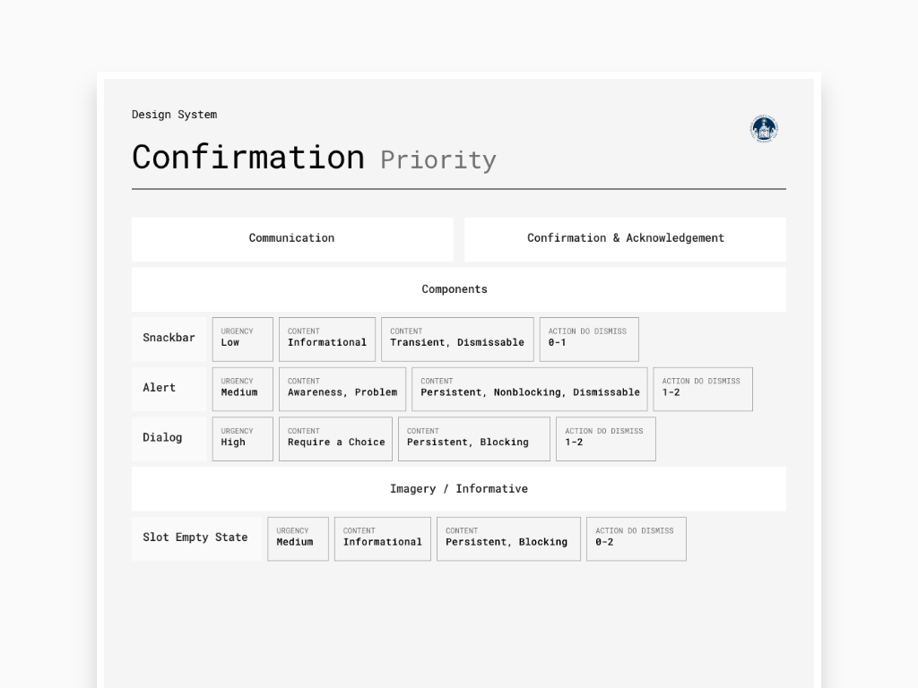
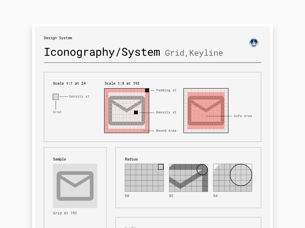
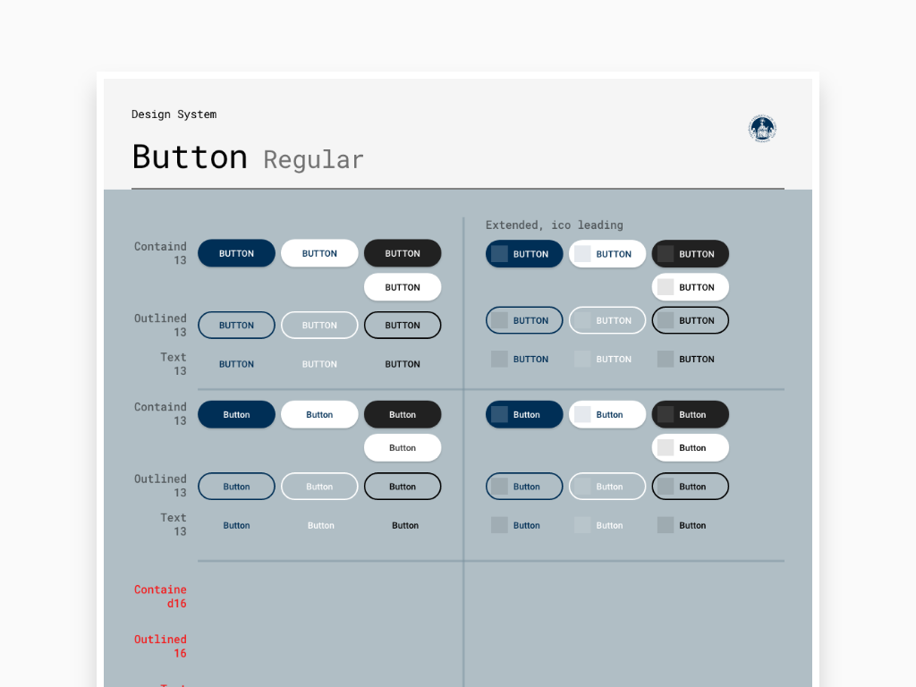
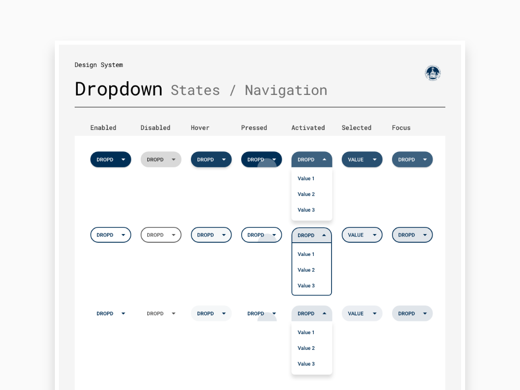
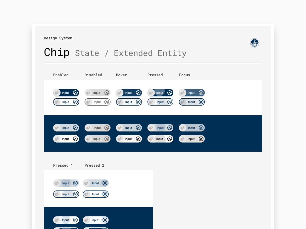
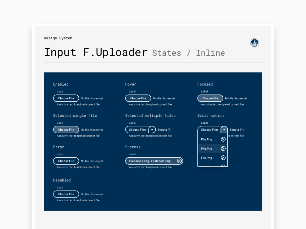
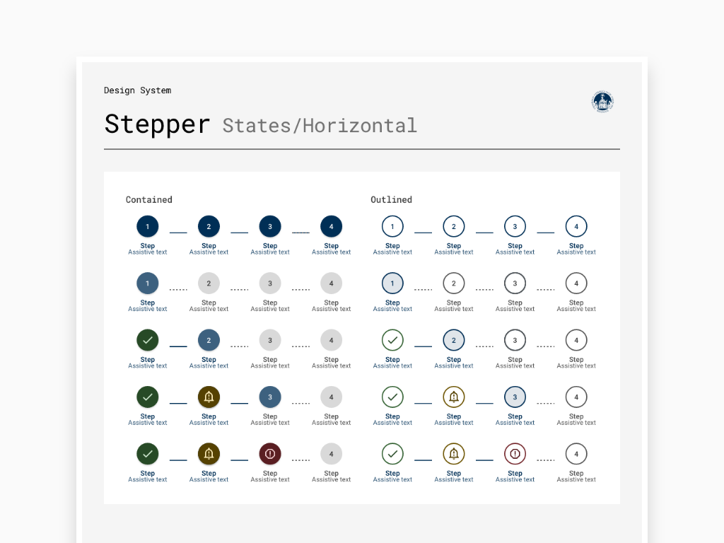
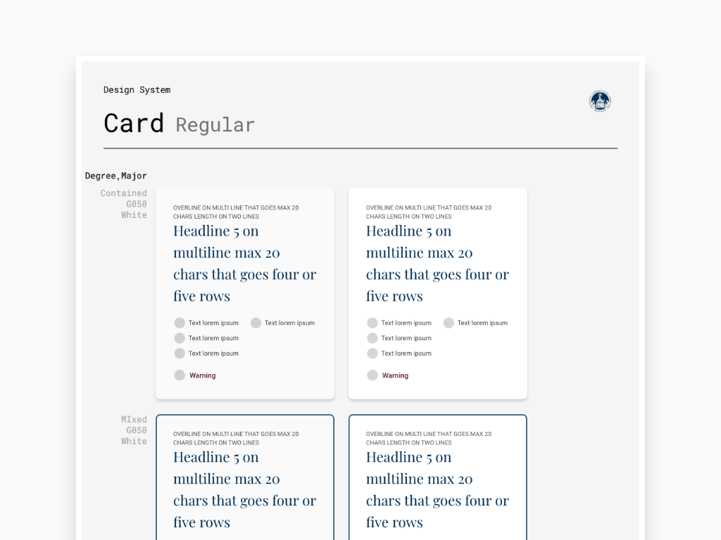
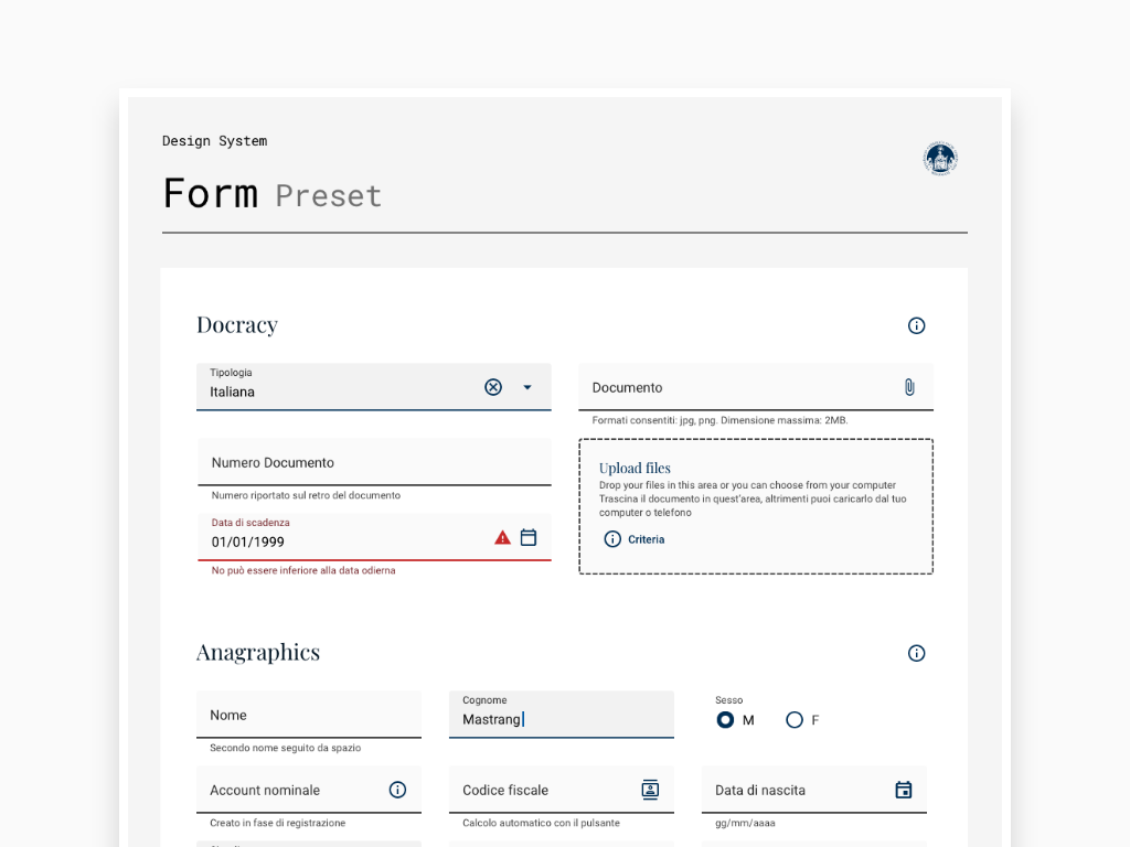
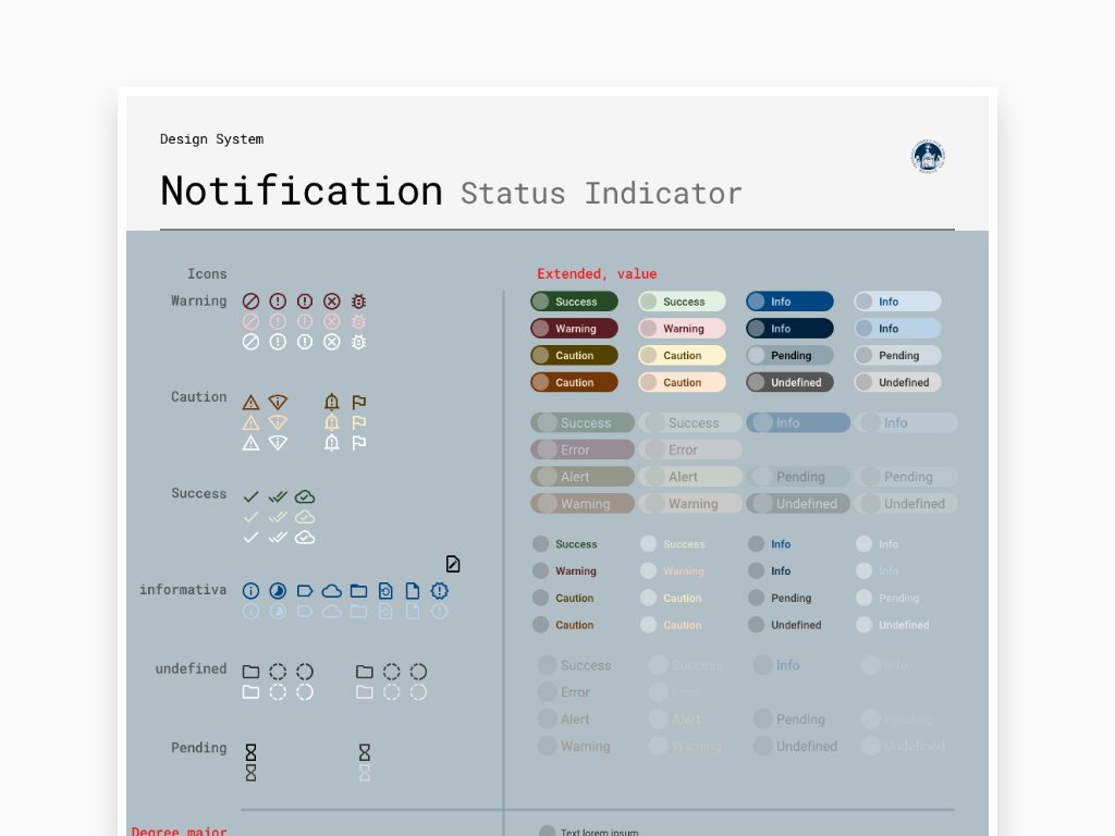
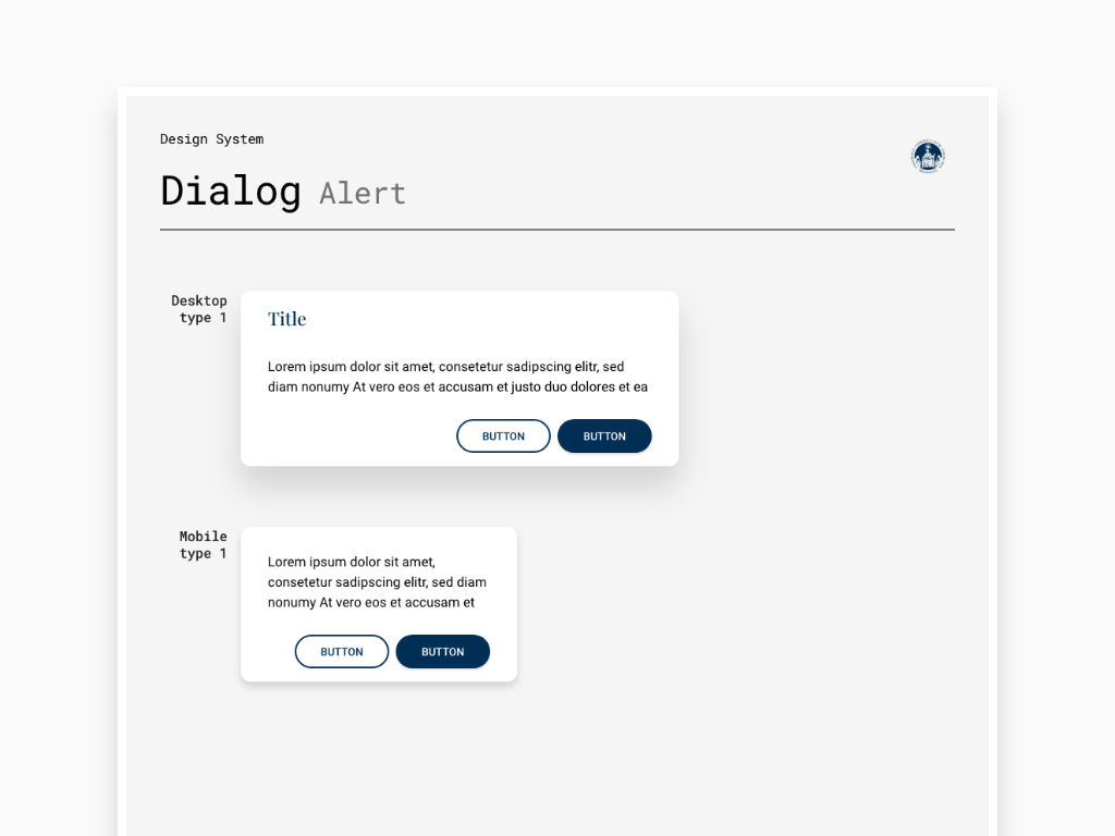
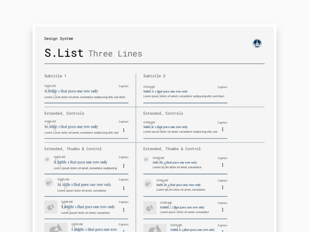
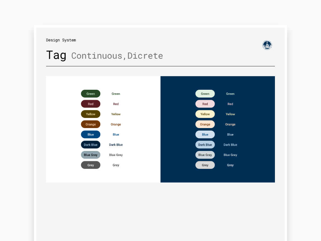
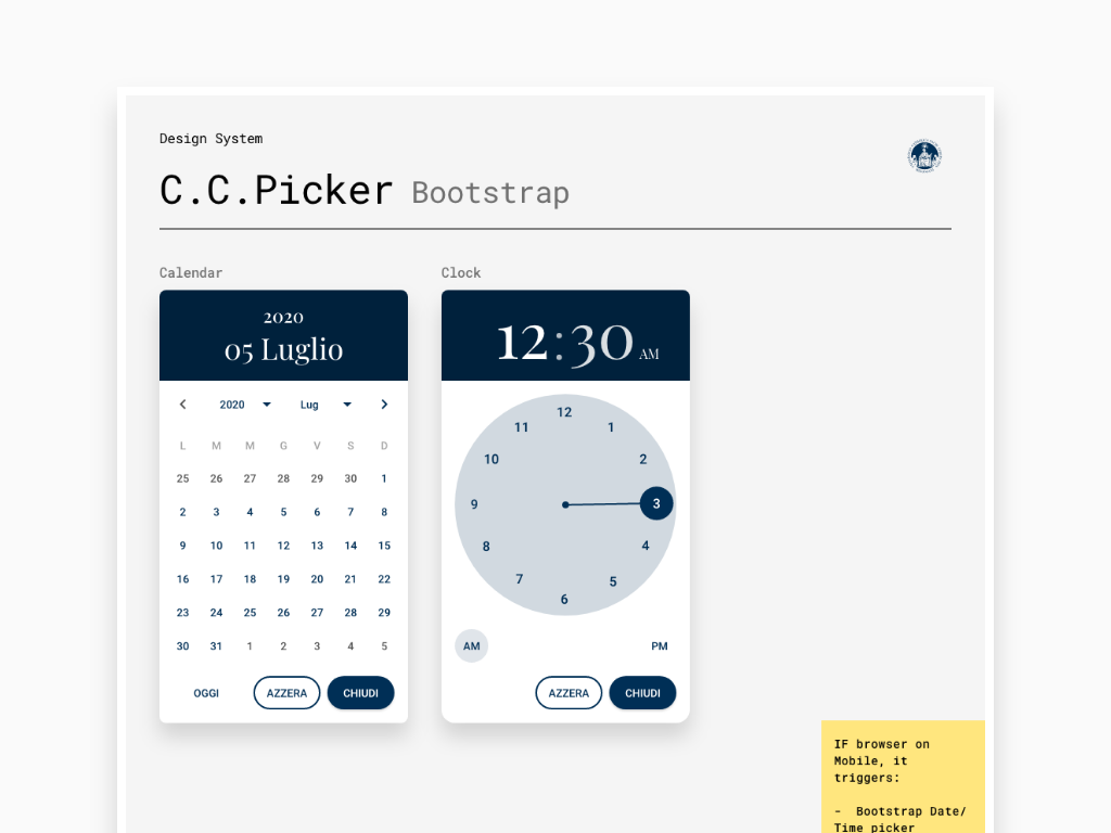
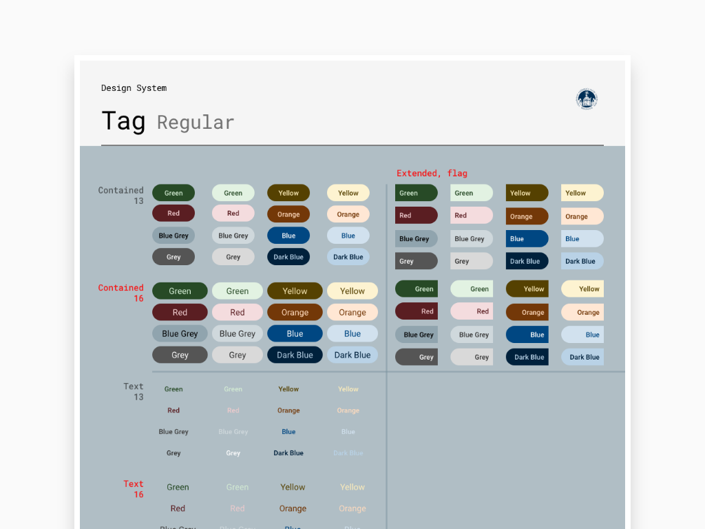
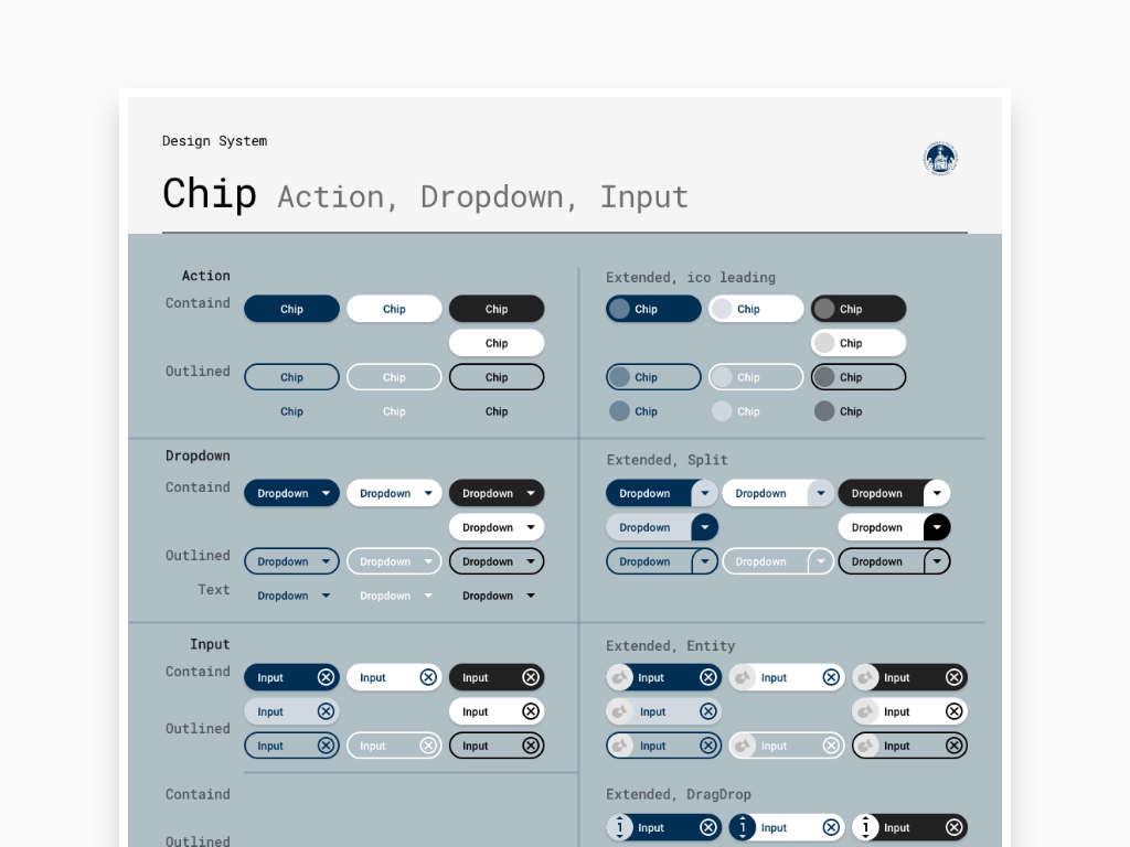
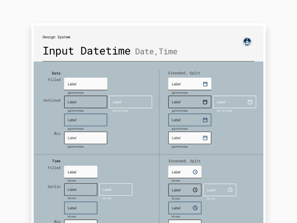
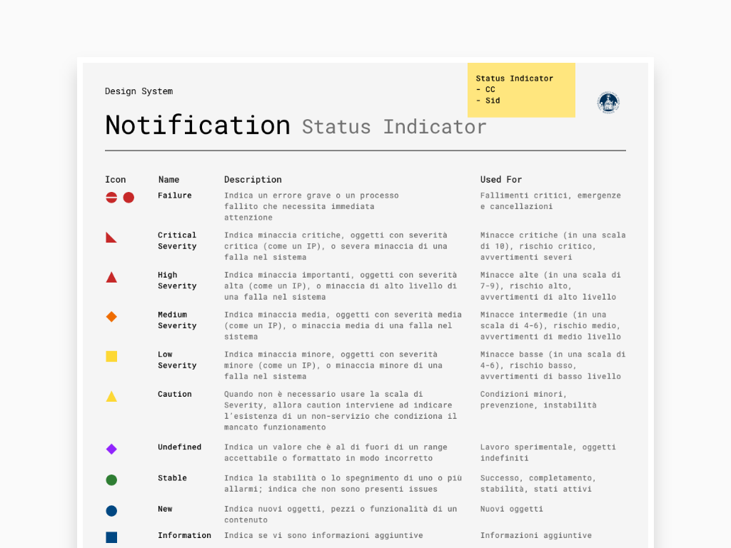
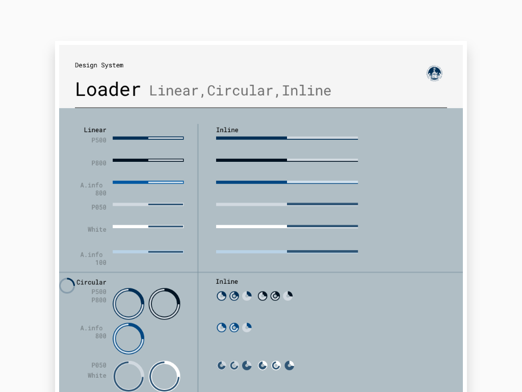
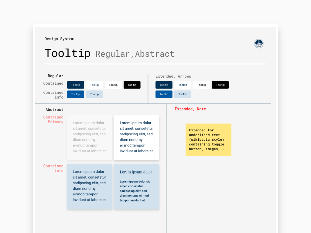
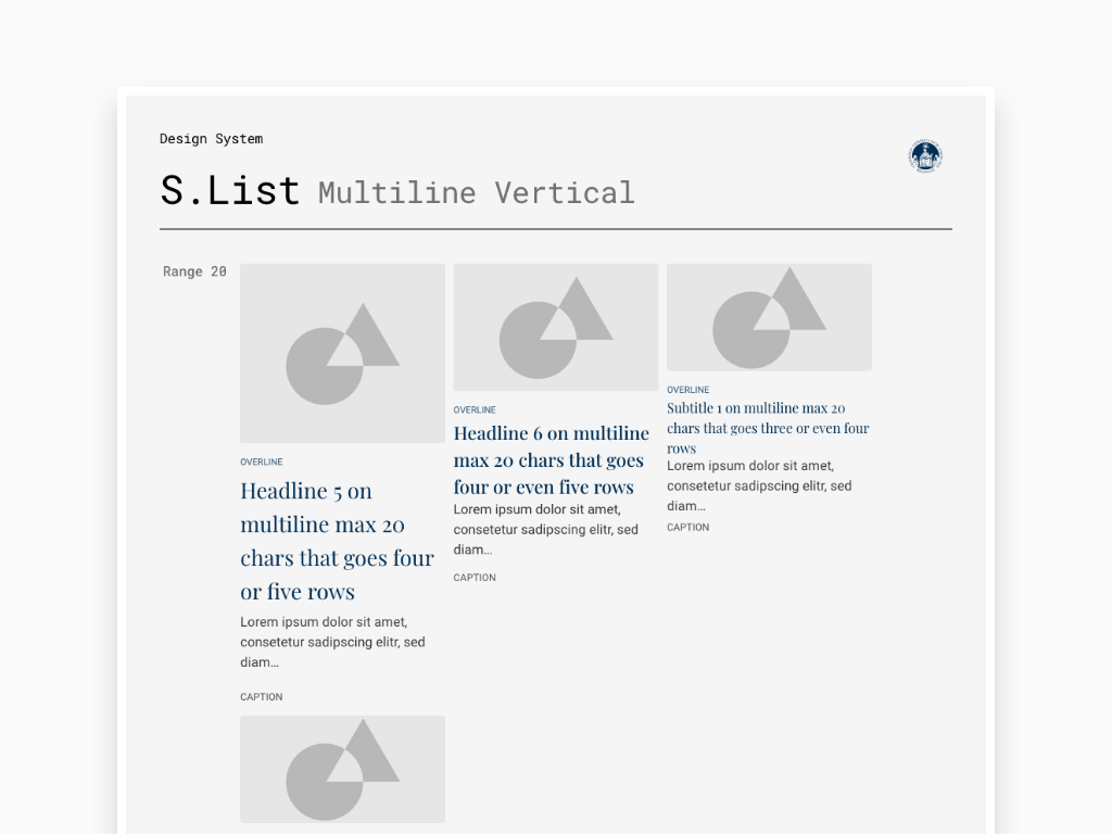
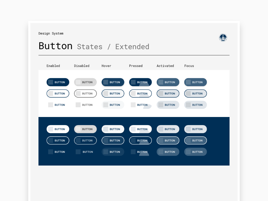
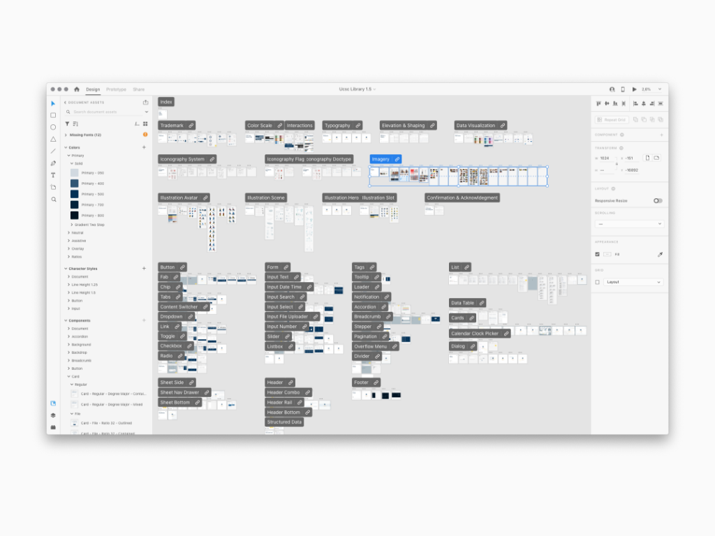
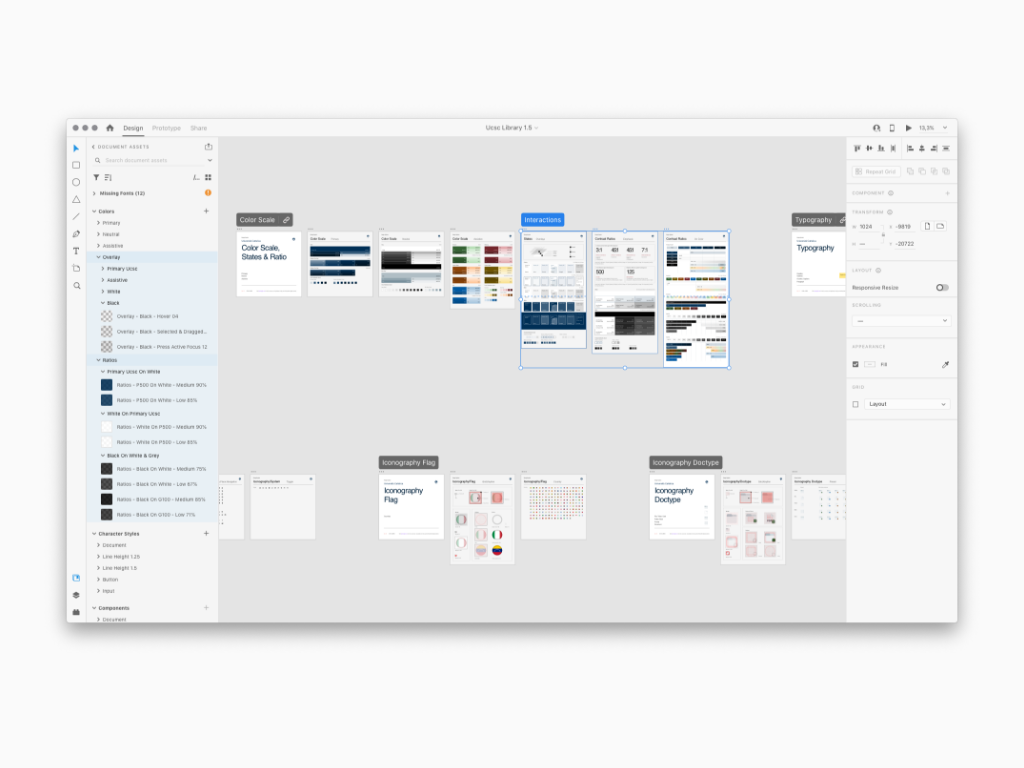
List of all Foundation rules in the form of dynamic symbols ready to be used

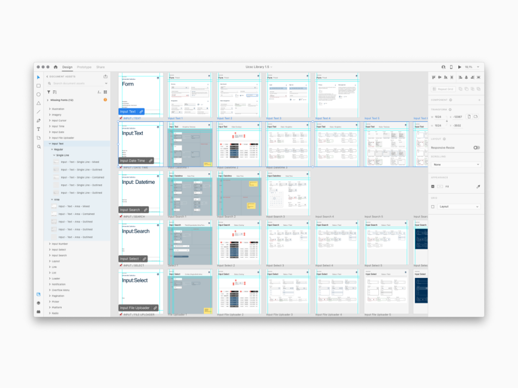
List of all Building Blocks in the form of dynamic symbols ready to be used

.


