Although HTML5 and CSS3 shifted development in favor of UX designers five years ago, I still get to see doubtful faces looking for the final enlightenment. Could it be ... most of UX designers have never ever spent their time studying code and even if they had lately, they are not comfortable with it, yet. In case you're the guy I'm talking about, well sit and relax. Imma spend a little bit of time typing some of the basic concepts you UX designer should know about, whenever a web project brief includes a responsive service.
Shall we begin with a bit of history? Of course, I ain't gonna expose the whole history starting from Tim Berners Lee. How did we end up speaking of responsive, while mobile concept wasn't even taken into account, about ten years ago? Well, if you missed the gap and you don't have clue about the shape of a floppy disk, take your time and join the newbie club. Coz I've been watching this game since 1995 and I guarantee we made giant steps 'til today.
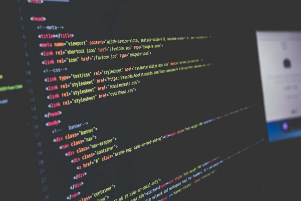
If you're passion driven and you'd like to develop the web, you must know the history of HTML and CSS, at least. Go ahead and check out client and server-side scripts like Javascript, PHP and much more like AJAX to get the fundamentals. How did this code evolve in order to serve a world market demand which auto-regulates itself throughout the years? For instance, I used to work with WURFL and Flash Lite, while HTML 4, CSS2 and plain Javascript (maybe scriptaculus and bunch of other libraries) were prominent, back in time. Not to mention the horrible liquid layouts!
Five years ago, HTML5 and CSS3 came along with Jquery bringing the concept of responsive vs adaptive, as more and more smartphones were produced. Nowadays Angular JS seems to be the new way to handle client-side. What's next? Who knows, depends on the market, UX designers and developers demands as usual.
We came a long way and the art of web development has changed. Yes indeed, you hear words such as Media Query, Pixel Aspect Ratio and Density many times. They are key-words to deal with a massive, wide range of device viewports present today, while you're planning a modern web design project.
Before we go any further, the first concept you need to understand is CSS pixels, and the difference with device pixels.
Next, you may approach browser concept between desktop and mobile. At this point, you may wonder why there are so many differences among mobile operative systems like Android, iPhone, etc. I know people speaking of this. Thus, I'm giving you this link to look at:
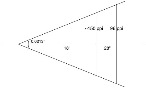
Thus I presume you know Pixel Per Inch (PPI) concept. Don't confuse PPI with DPI (Dots per Inch), which is used in Print world (since printers are set to read Dots). Also you may wonder how to figure out Aspect Ratio. It's mathematics, it's a very simple formula.
Once you've got the idea, take a look at the concept behind the media query. For instance, you must know that this css technique allows you to manipulate the Ui on specific device carrying a specific pixel aspect ratio whether they are retina or not. Having said that, it's important to you UX designer control which device should be served with image at its the highest definition. Cool isn't it? Now you know where you're going, awright?
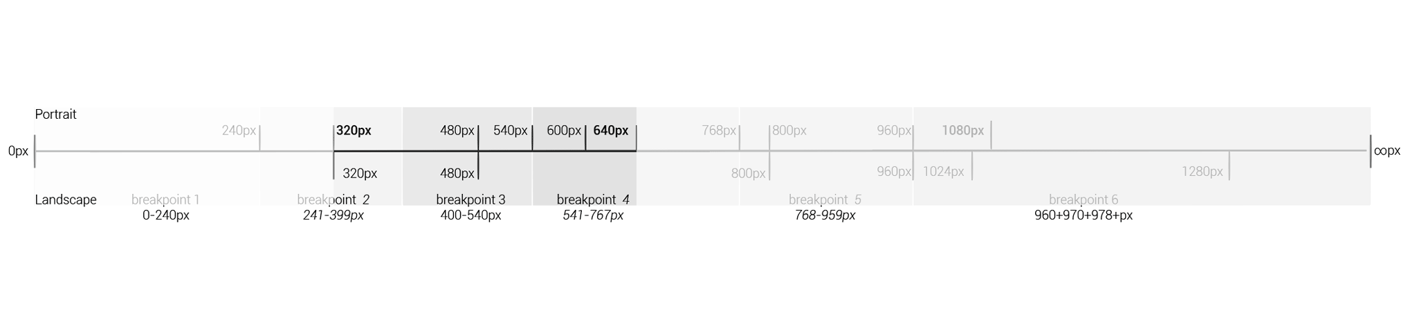
Too much information at a glance. I know! Reason why I'm giving you this piece of paper I drew. It's a list of Breakpoints most used today. You may want to keep it as point of reference, whenever you have to define a resolution range based on customer and device needs. Doing so, developers'll know what media queries put out there.
in this case I defined a range between 320 and 640. As time goes by, I can add new resolutions and/or deprecate older ones.
INFORMATION DESIGN (iD)
It's my belief, that a UX designer must provide developers with final resolutions previously planned. Accordingly, every time I build the Information Design, I always take measures into account as well. But wait, this is not a native app. We're working on web responsive layouts. What measures? How many? I'm speaking of measure for each breakpoint defined before and they're going to be as many as media queries I want to consider.
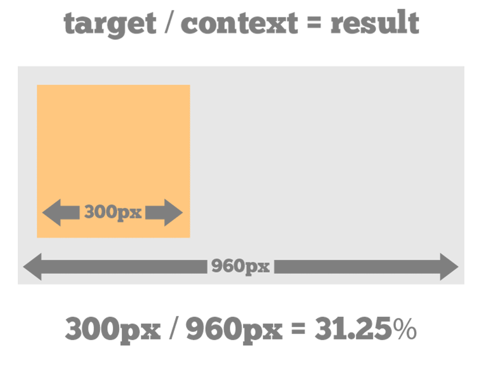
Since Ui must be flexible, measures must be in percentage. There's a specific formula. Take the width (in pixels) of the element you wish to convert and divide it by the width of its container (in pixels). The result is a fractional value that you convert to percentages. As a result developer will be able to implement the Ui asset correctly.
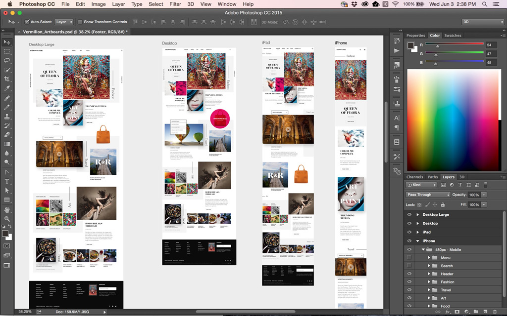
Photoshop cc 2015 has introduced a new feature called Art-boards (pretty much same thing as Illustrator) giving you the chance to design the same user interface at as many different resolutions as many breakpoints. If you are a web or UX designer, you increasingly find yourself designing websites or apps for multiple devices. Artboards help streamline your design process by giving you an infinite canvas on which you can lay out designs for different devices and screens. While creating artboards, you can choose from a wide variety of preset sizes or define your own custom artboard size. There's even more, device preview feature you get real-time previews of your .Psd on multiple iOS devices (only).
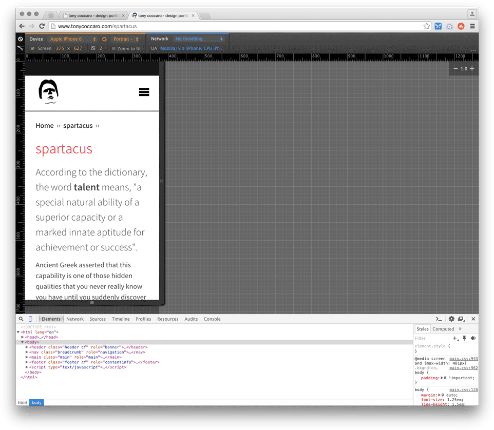
DEVICE SIMULATION
As Ui is being implemented, developers should warn UX designer from time to time. Unless you have access to a wide range of devices and you want to preview via MAMP localhost, you may want to consider either Chrome Developer Console or any other service depending upon what O.S. like Genymotion for Android. In any case I always keep the three main Player installed and up-to-dated, iOS, Android Studio and Visual Studio Express